

The footer is often overlooked when it comes to designing the page. However, it’s also one of the most important locations on the page. It needs to be well-designed and usable just like any part of the page. Fortunately, this is easy to do with Divi. In this article, we’ll look at 5 tips to create a user-friendly Divi footer.
5 Tips to Create a User-Friendly Divi Footer
1. Include the Major Elements
Our first tip to create a user-friendly Divi footer is to include the major elements. Every footer needs some basic elements. I’ve separated them into five categories, and there are multiple options for each category. I recommend only using one, or two at the most, from each of these categories. Some, such as links can include one or two sets of elements. The fewer the elements you use, the better. This helps keep the footer small and uncluttered.
Here are a few tips for each of the categories. I’m using examples from the free Divi header and footer layout templates. You can find them by searching for “free footer” in the Elegant Themes blog.
Graphics
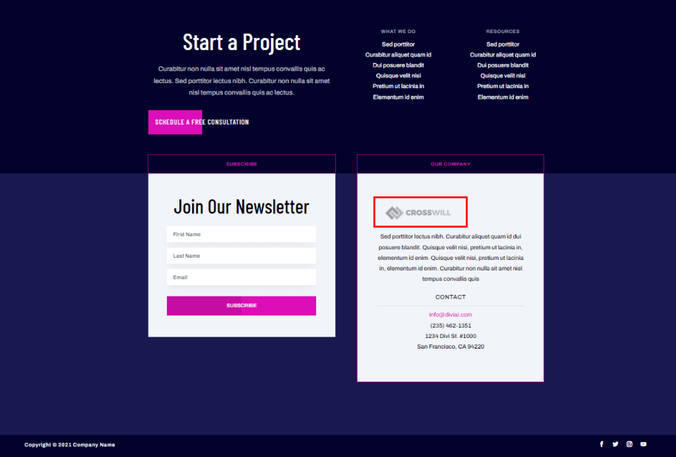

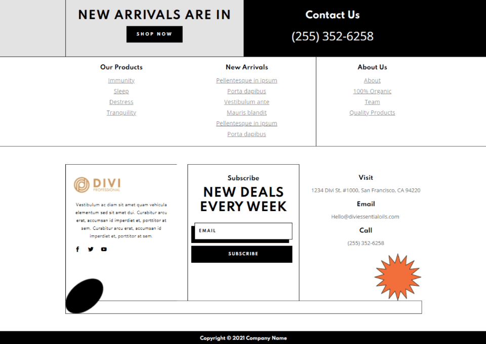
Graphics stands out and help draw attention to the footer. Add your logo or a small image. This is great to show partners, clients, social networks, a specific product, etc. Don’t’ include too many, though, or the footer can look cluttered and hard to read. This example shows the website’s logo in a small area about the company.
It’s better to use an icon than a word when both provide the same information. For example, instead of spelling the word Twitter, use the Twitter icon. Instead of spelling the name of a client, display their logo. Add the name in the alt text and as a hover tooltip.
Call to Action
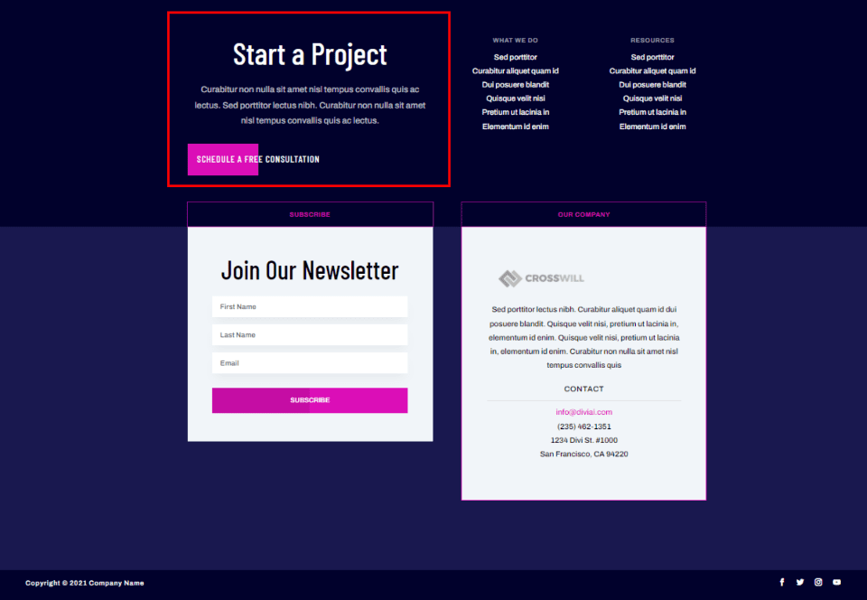

The footer can be valuable conversion space. A small call to action in the footer can be your last chance to get a response from the visitor. Include one call to action such as an email signup form, a button that links to your shop, a donation box, etc. It should stand apart from everything else and be easy to understand.
This example adds a CTA at the top of the footer that includes a large title, a short description, and a styled button.
Links
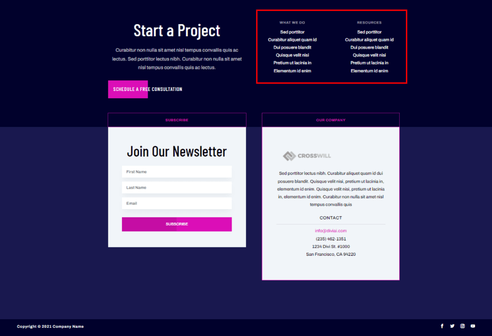

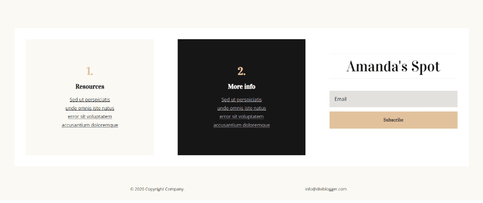
Links should include pages such as the about page, contact page, company information, team members, legal information, etc. You can also include links to your latest or popular products, featured posts, etc. This example adds two columns with links to services and resources.
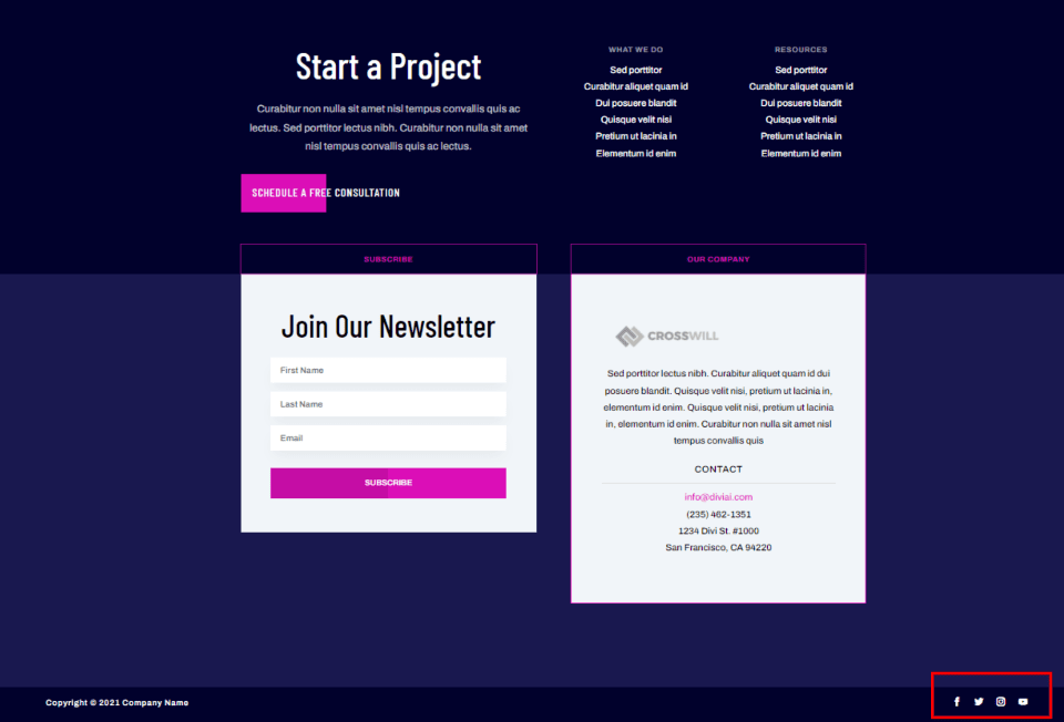

Another important type of link is your social media. Include icons for each of the social networks so your visitors can understand them at a glance. You can make them large or small. This example places them at the bottom.
Basic Contact Information
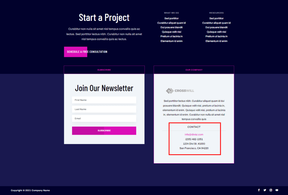

Provide basic contact information that shows the easiest way to contact you. This can include your email, address, phone number, or even a small contact form. Link to your contact page for more detailed information. This example adds the information as text under the company information.
Company Information
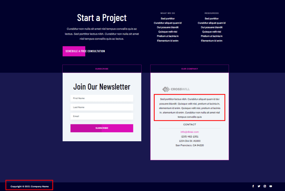

The company information includes mission statements, links to your team members, copyright notice, and information about your use of cookies. The copyright notice is usually placed at the very bottom and includes the company name and the year. You can spell the word copyright, use the copyright symbol, or include both.
This example adds a small paragraph with company information within a prominent area of the footer. The copyright is placed at the bottom and is minimized.
2. Simplify the Elements

Our second tip to create a user-friendly Divi footer is to use simpler versions of the elements. Keeping any design simple is a good general rule, but this is even more important in the footer. It’s important to keep your footer from looking cluttered. Use simpler versions of the elements than you’d use within the body of the website. This example shows simplified elements in separate areas with lots of space between them.
Rather than a contact form with lots of questions, use as few fields as possible. For an example of work, don’t include examples with lots of detail. Instead, use a small image and a short sentence or a title. For a call to action, just use a button with a short sentence or title. Use lots of white space between the elements to keep them clean and easy to see.
3. Integrate Your Theme Design


Our third tip to create a user-friendly Divi footer is to integrate your theme’s design. The footer needs to look like it belongs on your website. It shouldn’t look like a box tagged on at the bottom. It should be designed. At the same time, it needs to be simple and easy to use. This is usually done with darker colors, fewer colors, and a more simplified design. You can also use different background colors for the various sections of the footer.
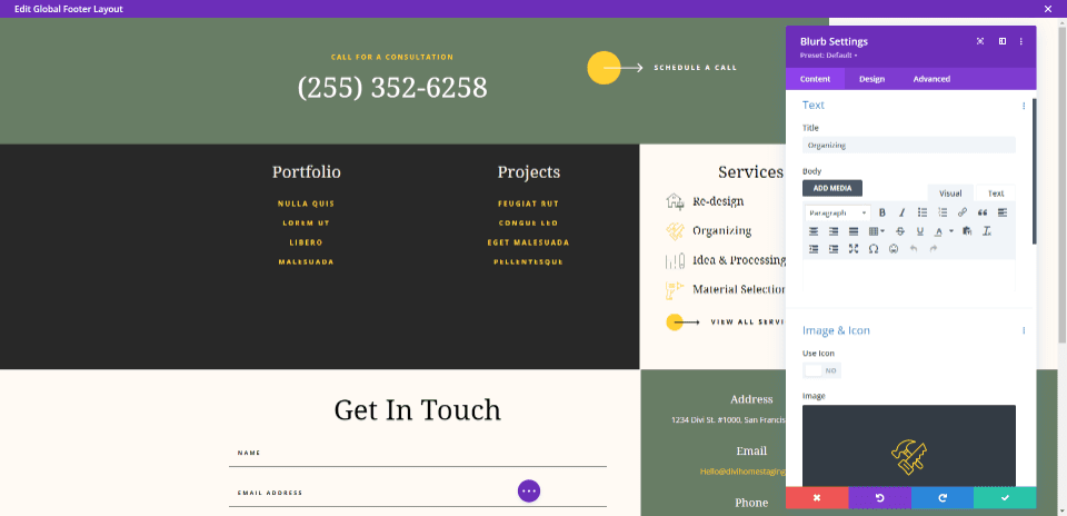

Use the Divi Theme Builder to create a global footer and use the design elements from your website. Use a few of the same colors, fonts, buttons, etc. This example shows the footer from the earlier image opened in the Divi Theme Builder.
If you want your footer to stand apart from your website, you can use smaller fonts and buttons and make use of darker colors. For fonts, use sans serif and lighter weights. Your footer design doesn’t have to stand apart from the rest of the page, but it is something to consider for your website design.
4. Check the Contrast

Our fourth tip to create a user-friendly Divi footer is to use good contrast. Less-important elements can be smaller and have lower contrast than the rest of your website. This is ideal for elements at the bottom of the footer. This informs the visitor that it’s not something they need to focus on every time they view the page.
For example, the bottom line with the copyright information can be the lowest contrast so that it doesn’t distract from the rest of the footer. However, the footer’s contrast still needs to be designed with usability in mind.
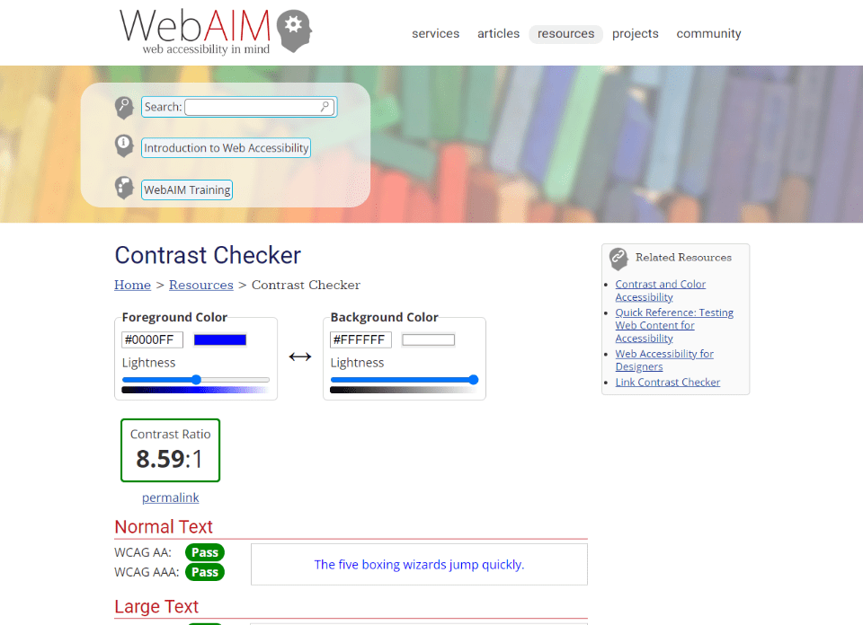

You can test your colors with online tools such as WebAIM Contrast Checker. Enter the colors you’re using, and it will give you a score with advice on why it works or how to improve it.
5. Check All Screen Sizes

Our fifth tip to create a user-friendly Divi footer is to make sure it’s responsive. Just like the rest of your website, the footer needs to be responsive. Test it on as many devices and screen sizes as possible. Every element should be readable and useable from any device.
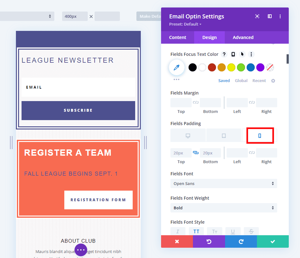

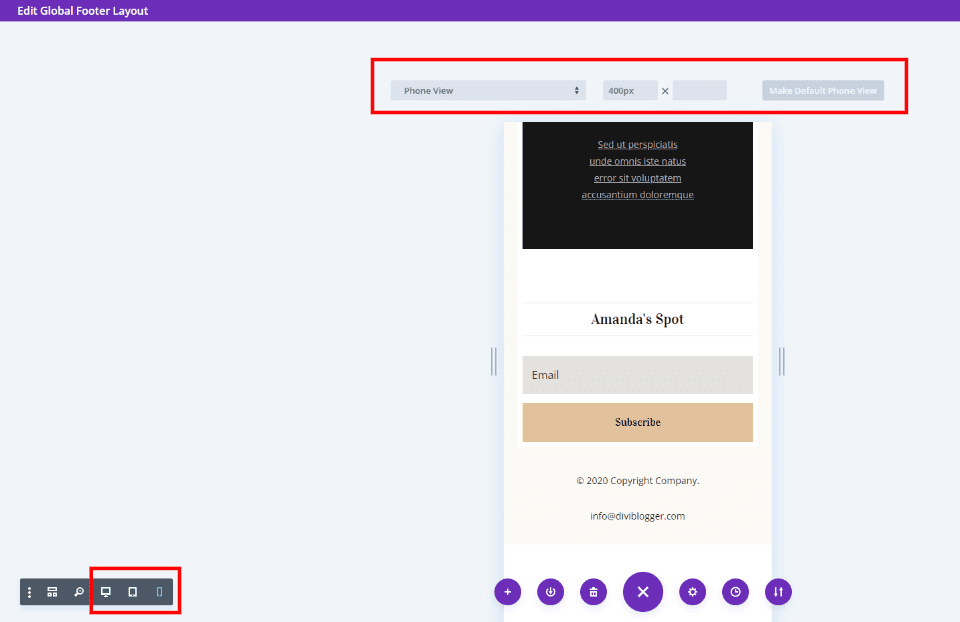
The Divi Builder includes settings that make it easy to adjust sizes based on the device type. Select the device icon to adjust the desktop, tablet, and phone versions of the website independently. Adjust the padding, font sizes, icon sizes, etc., for each device. If you don’t adjust the tablet and phone, they will follow the desktop sizes.
Ending Thoughts on Creating a User-Friendly Divi Footer
That’s our look at 5 tips to create a user-friendly footer with Divi. The key to everything in the footer is to keep it simple. Use simplified versions of the elements from your pages such as smaller forms, simpler CTAs, etc. Use colors, fonts, and graphics that match your site. Separate the elements to give them plenty of room. Following these tips will help you create a user-friendly Divi footer that will help you meet your website goals.
We want to hear from you. Do you have any tips to create a user-friendly Divi footer? Let us know in the comments.
The post 5 Tips to Create a User-Friendly Footer with Divi appeared first on Elegant Themes Blog.