

Divi’s blog module provides you with two default layout styles off the bat. Grid and fullwidth. But how do we choose? In this article, we’ll explore this question and compare Divi’s grid and fullwidth blog module layouts to help you decide between them. We’ll share some different examples using both styles as well.
Let’s get started!
Changing Your Divi Blog Module Layout
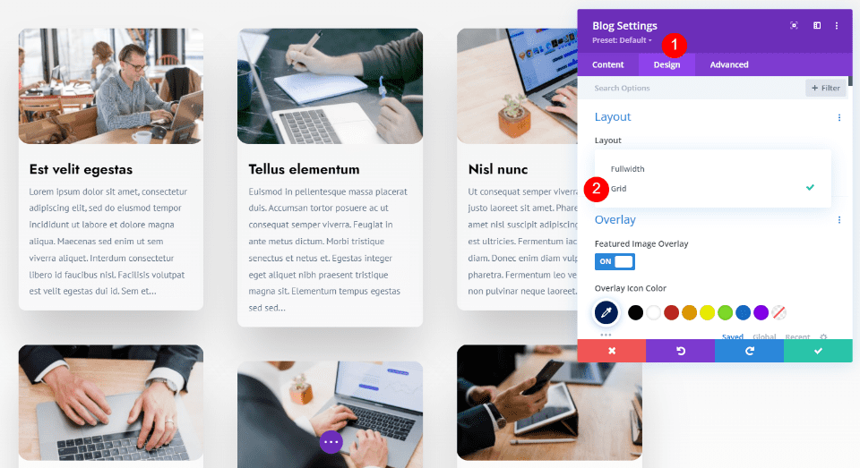

Before we get into our discussion, let’s see what we’re talking about and how to change between them. The Divi Blog module includes settings to choose between Grid and Fullwidth layouts. Go to the Design tab within the Blog module.
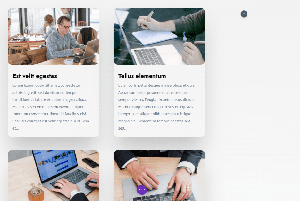
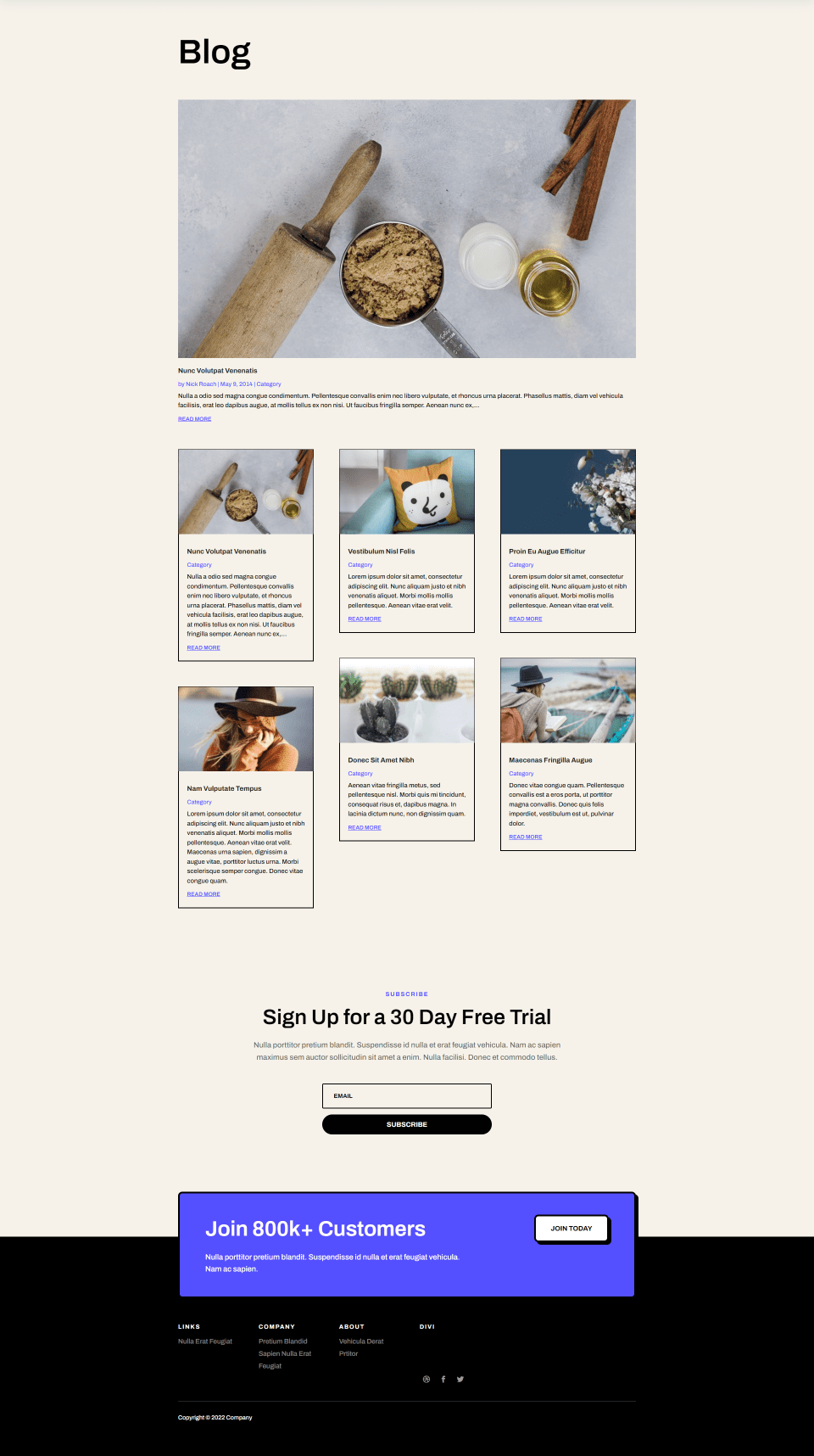
The first section is called Layout. It has a dropdown box with two options: Fullwidth and Grid. This example shows the Grid option. It displays 3 posts in a row by default.

The grid is responsive, so it will change the number of posts in a row to fit the page design. I’ve changed the number of Rows for this example. The grid has responded to display two columns.
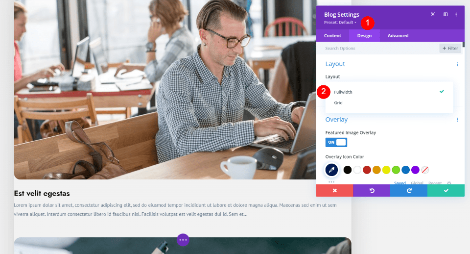

This example shows the Fullwidth option. It displays the posts stacked vertically so only one post appears on a single row. It’s also responsive, but it shows one post regardless of the width.
Let’s look closer at both designs.
Divi Blog Module Grid Layout

In blog design, the grid layout is more popular than the fullwidth layout. It places the blog posts on the page in multiple columns, creating a grid. Each post is presented as a card. The grid is responsive, so the number of columns will change to fit the screen.
Magazine blogs and portfolios are known for this type of layout. Sites such as Pinterest, YouTube, Amazon, and other online stores display content within a grid. The majority of Divi Blog Page layouts in the free Divi Layout Packs are in a grid layout.
Divi Grid Blog Layout Examples
Let’s look at a few Divi grid blog layout examples. These are the blog pages from some of the free Divi layout packs that you can select within Divi.
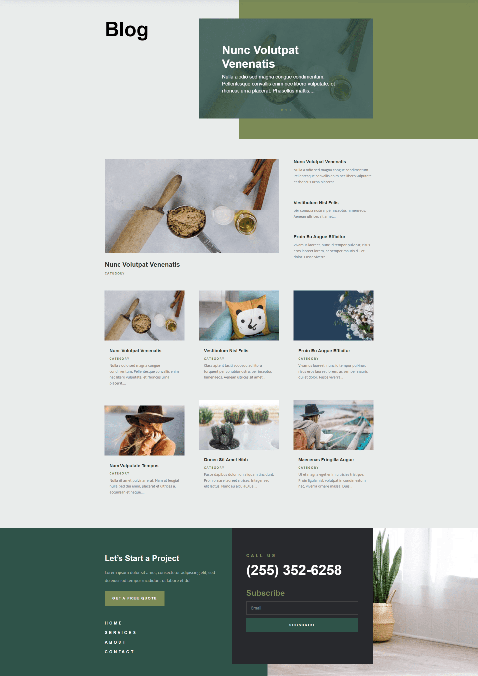
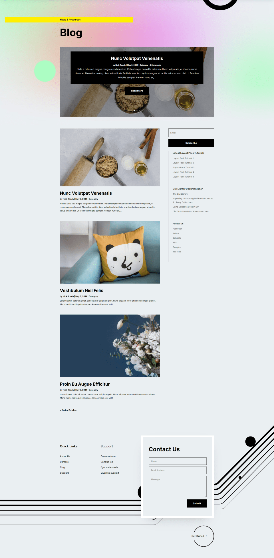
Software

The blog page for the Software layout pack includes a featured post in the hero section. The grid displays cards with a border, which helps them to stand apart. The metadata and Read More links are purple, so they stand out.
Landscape Maintenance
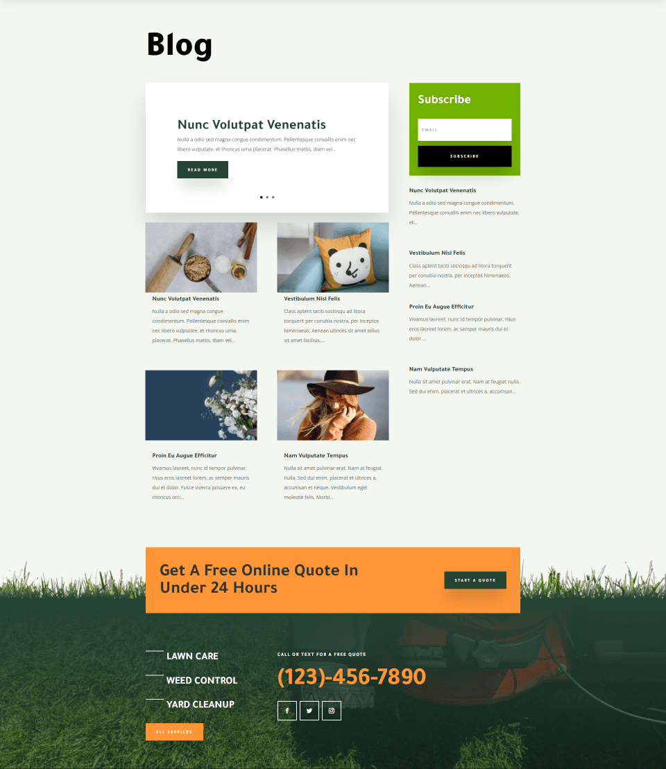

The Landscape Maintenance blog page utilizes a 2-column grid with a sidebar, which includes posts without featured images. The hero section includes a post slider without the featured image. The blog cards have a minimal design that looks clean.
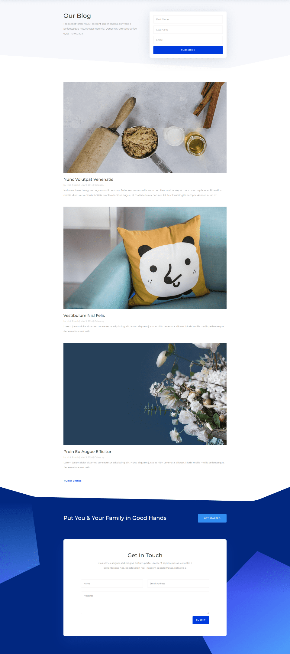
Flooring

The Flooring layout pack blog page uses a 3-column grid with a couple of features that lead into the grid. The hero section displays a post slider without a featured image. The next section displays the latest post in one column and three more posts without featured images next to it.
Grid Layout Pros
- The grid design is structured well. Cards present a lot of information in a small space. It makes excellent use of space. Posts take less space on the page, which can be important real estate for CTAs and other elements. The page can be smaller.
- Users can see more information at once because there’s more content on the page. This allows for more content in less space. This looks better with wide screens.
- Since there’s more on the screen at once, users can find the content they’re interested in much faster. It’s easier to scan the page and easier to scroll through the content to find older posts.
- The metadata is more prominent, so users have more opportunities to select the categories, authors, etc.
- It’s easier to divide content into categories like a magazine, making it the best choice for category layouts.
- It’s responsive, so posts become fullwidth on mobile devices.
Grid Layout Cons
- There’s usually a lot of content on the page, making the page more cluttered.
- Featured Images are smaller, so they don’t stand out. This brings less attention to the images.
- Loading more content can impact the page loading time.
- It’s easier to overlook a post because they can blend in.
Divi Blog Module Fullwidth Layout
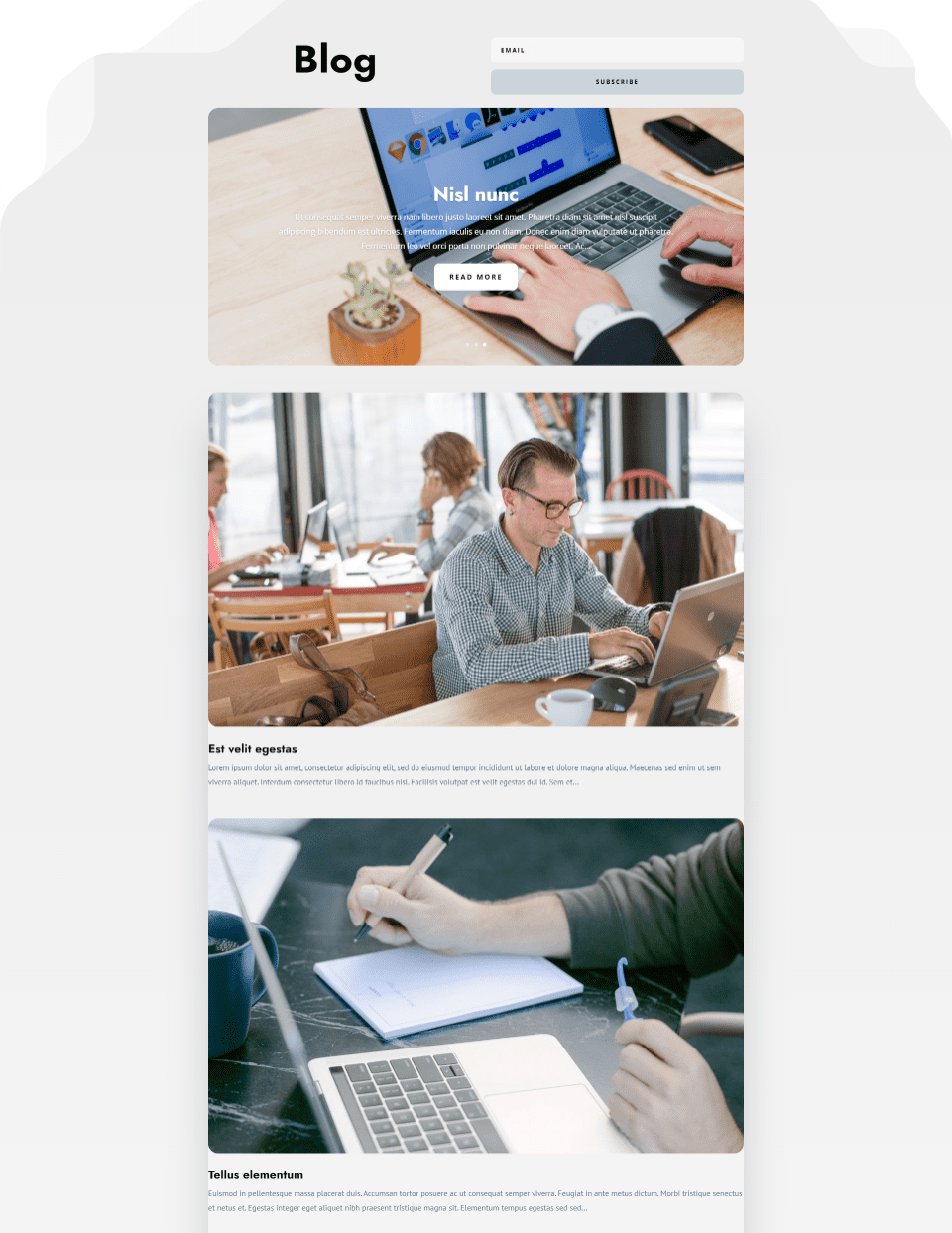

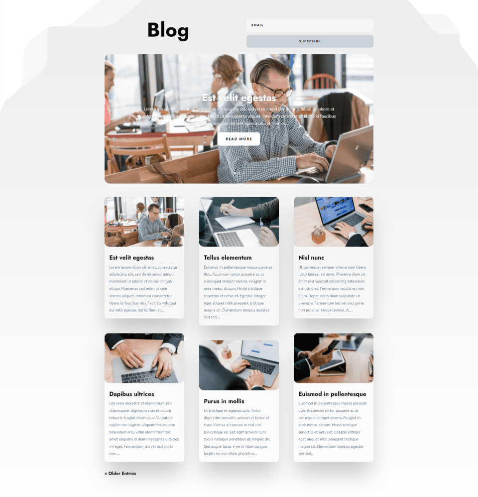
Fullwidth layouts place the blog posts in a single column, so posts are stacked vertically. With a full-width layout, the featured image is the most prominent element of the blog post.
Sites such as Facebook and eBay’s search results display in full width. It’s also a popular option to display details about services.
Divi Fullwidth Blog Layout Examples
Let’s look at a few Divi fullwidth blog layout examples. These are the blog pages from a few of the free Divi layout packs.
Social Media Consultant

Here’s the blog page for the Social Media Consultant layout pack. it includes a sidebar, so the featured image doesn’t take an excessive amount of space on the page. The titles are large and bold, making them easy to see and read.
Insurance Agency

Here’s the blog page from the Insurance Agency layout pack. This one does not include a sidebar. This keeps the focus on the featured images.
Physical Therapy
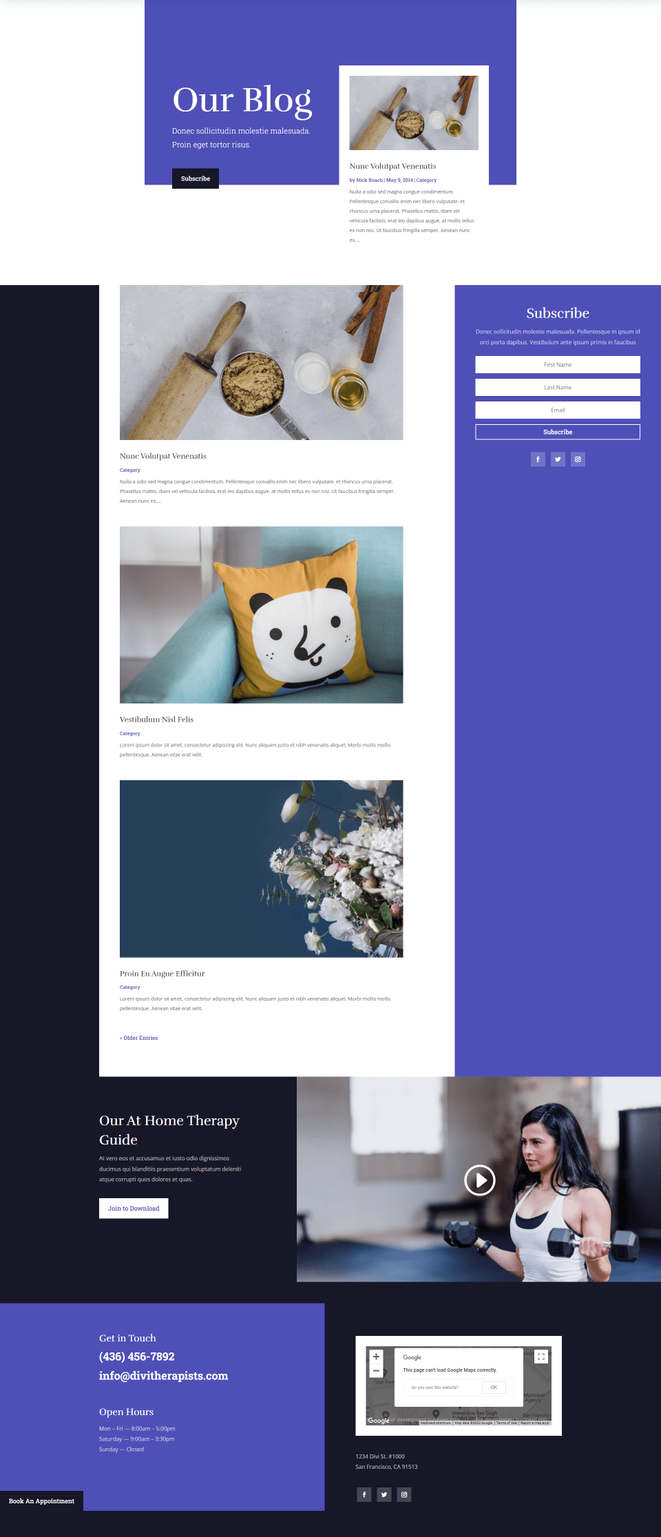

Here’s the blog page for the Physical Therapy layout pack. this one includes a sidebar, but also uses color and other design elements to use the whitespace.
Fullwidth Layout Pros
- Since all of the featured images are fullwidth, they stand out.
- Each post takes more of the screen, so they all get attention. This improves engagement with each post.
- The design is more minimal. This makes it a less cluttered design.
- It works great with sidebars and other elements.
- You can use CSS or plugins to get even more layout options, such as placing the image on one side and the excerpt on the other. You can take this one step further and present the posts in an alternating layout.
Fullwidth Layout Cons
- Since the images are fullwidth, they can be too large. Each post takes a lot of space on the page. This is especially true if you’re not using a sidebar.
- Pages are harder to scan. It requires a lot more scrolling to see a few posts, so users can’t glance at the page to see what they’re looking for. Pages can take longer to scroll through.
- The layout doesn’t work well for magazine layouts. It’s more difficult to place posts within categories on the page.
- If the featured images are made smaller, the layout can have too much whitespace on the page.
- It’s easier to miss a post if the user doesn’t scroll through the page.
Choosing Between Divi’s Grid and Fullwidth Blog Module Layouts
When choosing between the two, there is no right or wrong answer. Every website’s design and needs are different. Here are some thoughts you can keep in mind when choosing:
- Choose the layout that best fits the design you’re after.
- Look through the Divi blog layouts to see which design draws you the most.
- Consider the pros and cons of each and see which is better for your needs.
- Leave it up to your audience. Check your stats to see which screen sizes your audience uses the most. If the majority of your audience views your blog on a desktop, then a grid layout might be your best option. If the majority of your audience views your blog on mobile, then a full-width layout might be your best option. Divi is responsive either way, so you could go with a grid layout and have a grid on desktop and fullwidth on mobile.
- Grid layouts are better suited for magazine-style blogs. You can group and present different categories easier. It’s also better if you want to showcase lots of blog posts. It shows more posts on the page and they’re easier to navigate.
- Fullwidth layouts are better if you only have a few posts or if you don’t post that often. It’s a good choice if you want to draw attention to each post in the feed. They’re also good if you don’t need to showcase different categories.
- Test out a few blogs yourself and see which you like to use.
- If you’re not sure which would work best for your audience, you could always try an a/b split test to see which layout gives you the most traffic.
- Use them together to create some interesting layouts.
Ending Thoughts
That’s our comparison of Divi’s grid and fullwidth blog module layouts. Both layouts provide elegant blog designs. You can even use them together by adding the latest post to the hero area to help break up the page design.
With the Divi Blog module settings, it’s easy to change your blog layout. You’re not stuck with the design you choose. You could try one layout for a while to see if you like it and then try the other layout. If you feel that your blog needs a change, simply choose the other layout to get a fresh look.
We want to hear from you. Which of Divi’s blog module layouts do you prefer? Let us know in the comments.
The post Comparing Divi’s Grid & Fullwidth Blog Module Layouts appeared first on Elegant Themes Blog.