


Usually, every layout pack that comes out on our blog includes a blog layout, which helps you get your blog ready in no time. But, have you ever wanted to see how to build one of those blog pages yourself? In this article, we’ll use one of those blog layouts to see how to build a blog page with Divi’s blog module. We’ll go step-by-step through every setting.
Let’s get started!
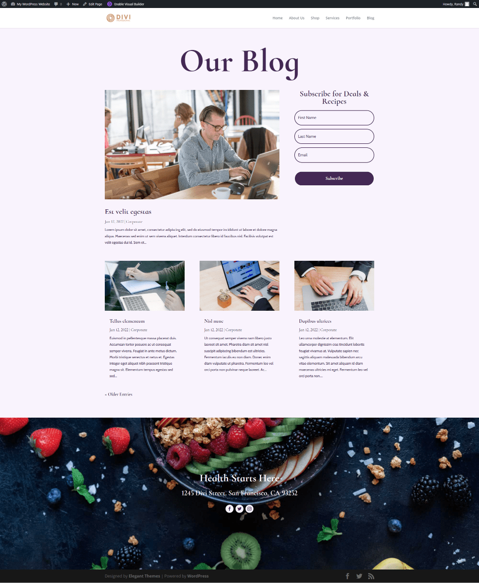
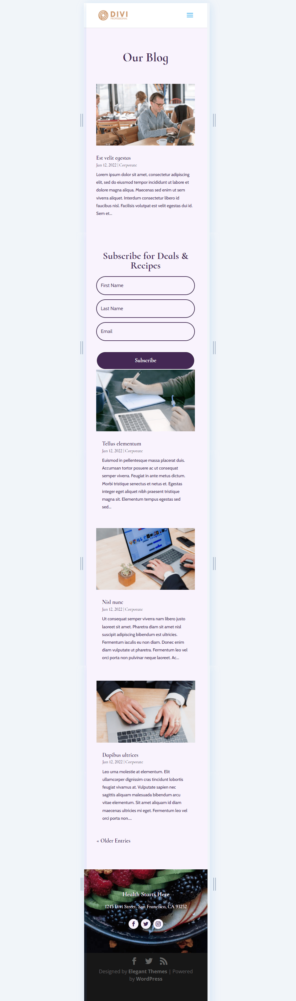
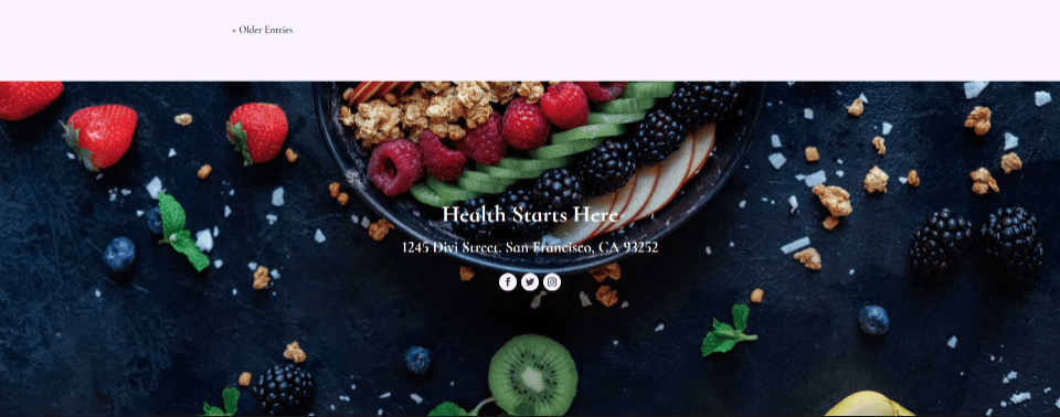
Blog Page Preview
First, let’s look at what we’re building.
Preview Desktop

Preview Mobile

Creating a New Blog Page
Create New Page
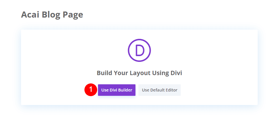
First, we’ll create our page. In the WordPress dashboard, select Pages > Add New.
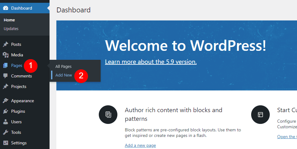

Give the page a title that makes sense to you. I’m using the name of the page from the layout pack, which is Acai Blog Page. Select any page attributes you want in the right sidebar. I’m leaving the attributes at their defaults.
- Page Title: Acai Blog Page
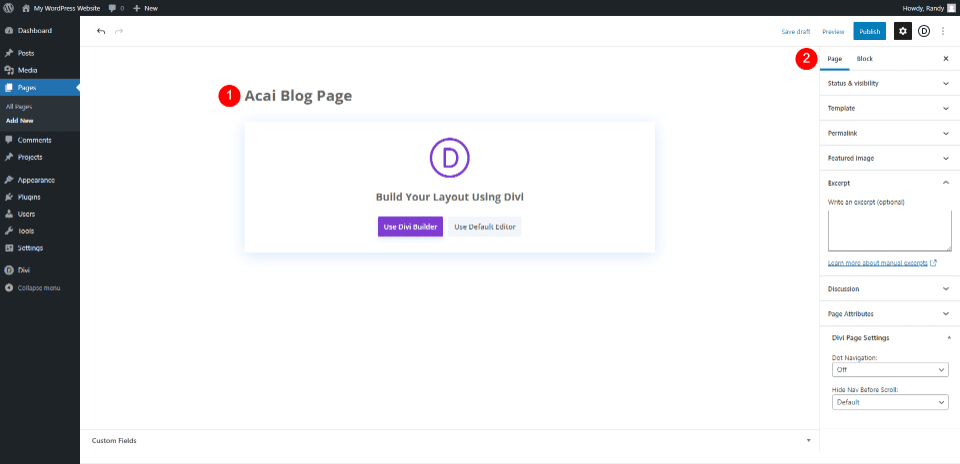

Switch Over to Divi Builder
Next, it’s time to switch to the Divi Builder. Click the purple button in the center of the page: Use Divi Builder. This will redirect you to the front end with the Divi Builder active, so we can start building the page.

Add Hero with Blog Page Title
Style the Hero Section
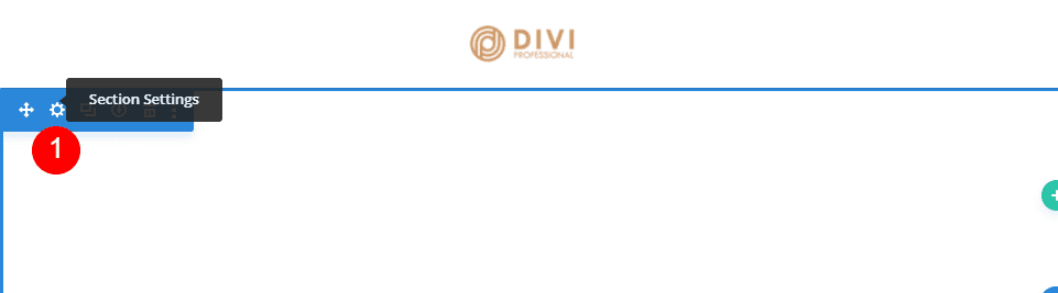
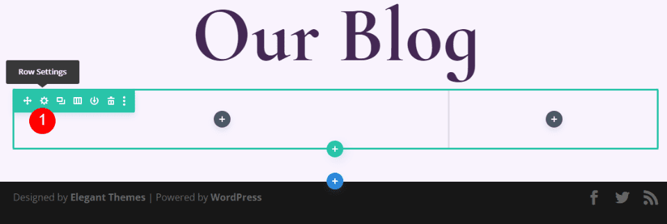
We’ll start with the first section. Open the section’s settings.

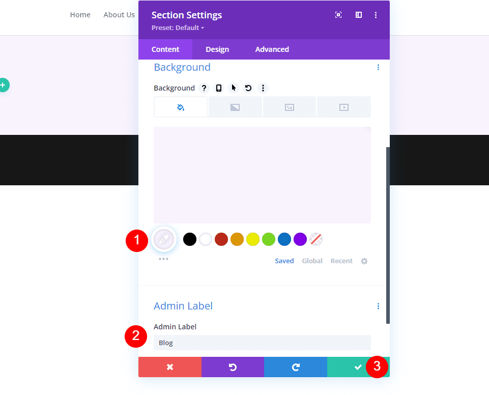
Scroll down to Background and change the color to #f9f3fd. Enter Blog as the Admin Label. Close the Section’s settings.
- Background: #f9f3fd
- Admin Label: Blog

Create the Blog Page Title
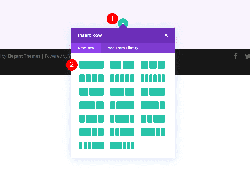
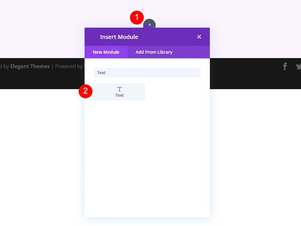
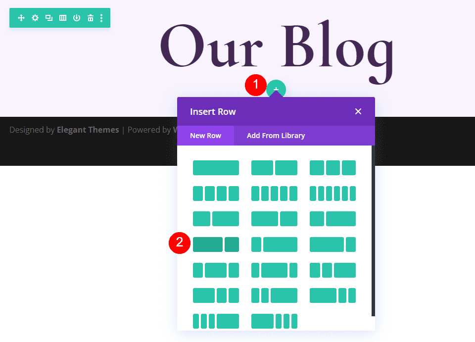
Next, we’ll add a Row for the title. Select the green icon and choose the single-column Row.

Next, add a Text module to the Row. If the modal doesn’t open when you add the Row, select the Gray plus icon and search for Text.

Style the Blog Title Text Module
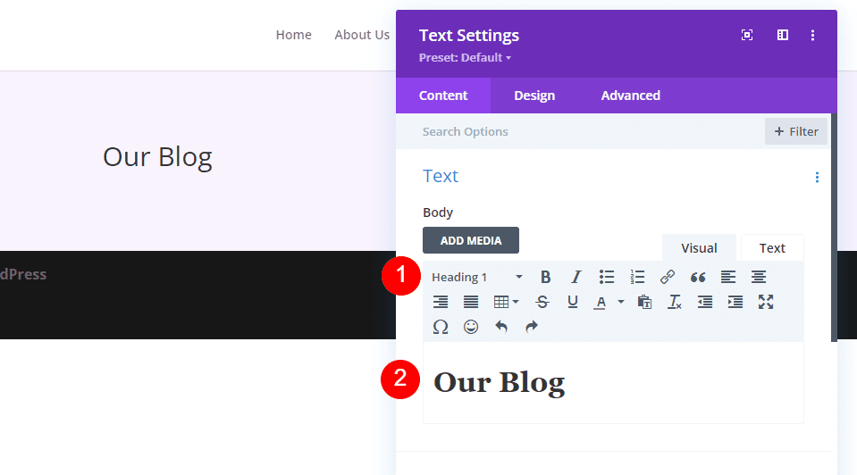
Open the Text module settings and select Heading 1. Add the title Our Blog.
- Font: Heading 1
- Text: Our Blog

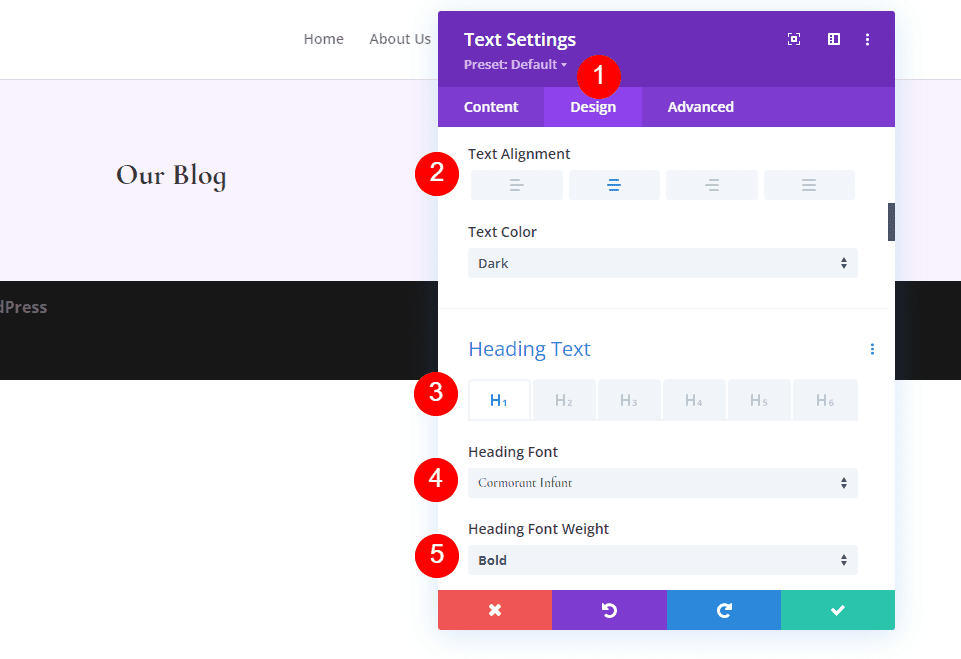
Next, go to the Design tab and set the Alignment to Center. For H1 Heading Text, choose Cormorant Infant for the Font and make it Bold.
- Text Alignment: Center
- Heading Text: H1
- Font: Cormorant Infant
- Weight: Bold

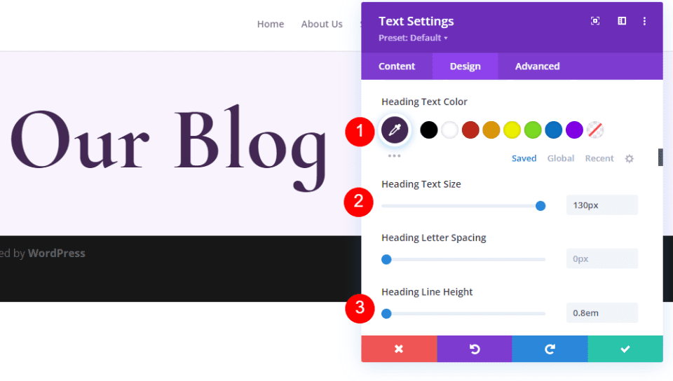
Set the Color to #442854, the Size to 130px (this is for the Desktop, we’ll change the tablet and phone in a minute), and set the Line Hight to 0.8em.
- Color: #442854
- Desktop Text Size: 130px
- Line Height: 0.8em

Hover over the Heading Text Size options and select the screen icon. Choose the Tablet icon and set the Size to 60px.
- Tablet Text Size: 60px
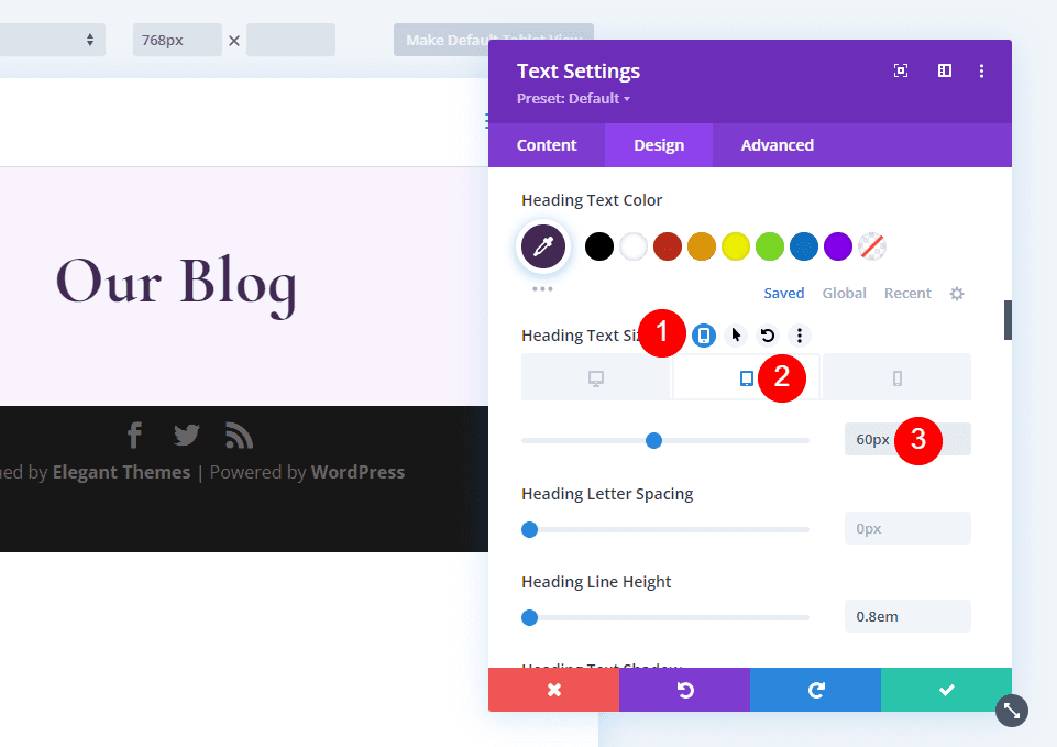

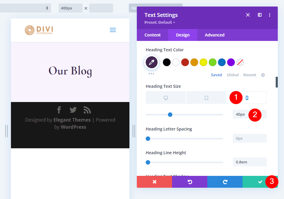
Lastly, select the Phone icon and set the Size to 40px.
- Phone: 40px

Create the Blog Page Latest Post and CTA
Our hero section includes the latest post and an email optin. Add a new Row under our first Row and select the Column design with 2/3 on the left and 1/3 on the right.

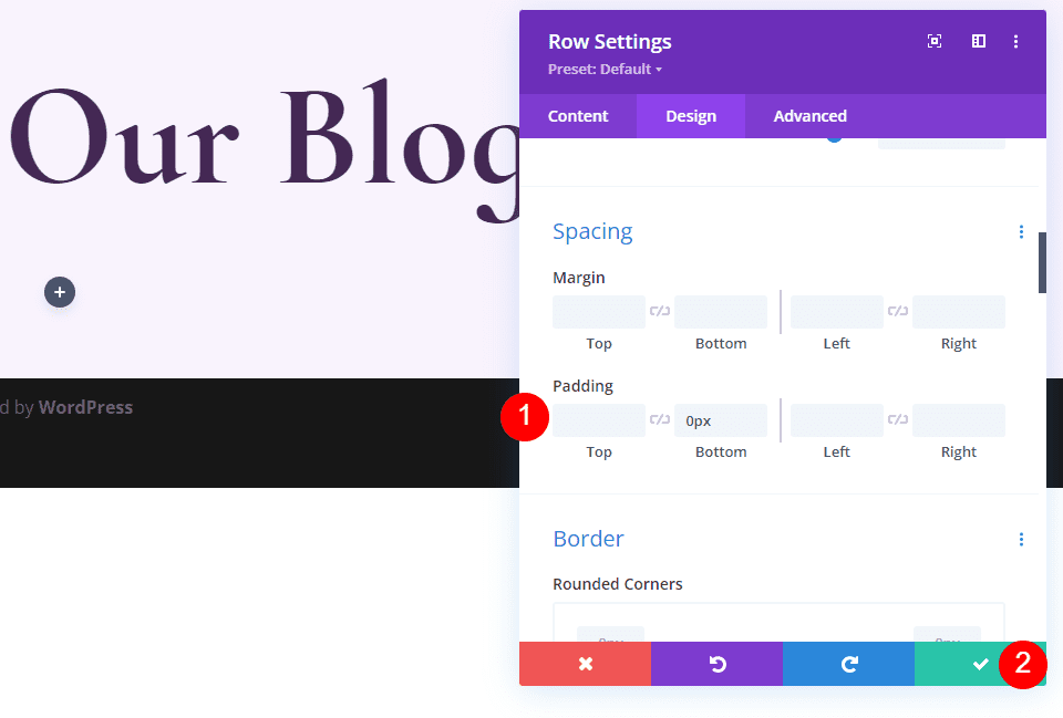
Open the Row settings by clicking the gear.

Select the Design tab, scroll down to Spacing, and add 0px to the Bottom Padding. Close the settings.
- Bottom Padding: 0px

Add and Style the Featured Blog Post Module
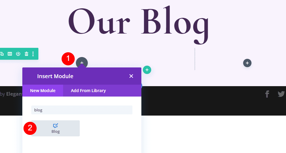
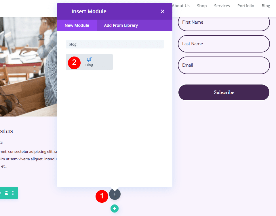
Next, we’ll add a Blog module. This will contain our latest post. Click the gray plus icon in the left column of our new Row and add the Blog module.

Content
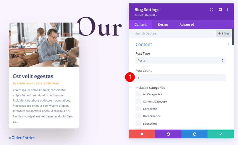
Under Content, enter 1 for the Post Count.
- Post Count: 1

Elements
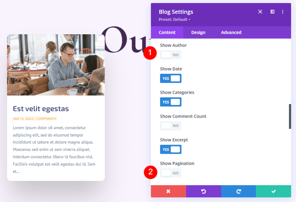
Scroll down to Elements and uncheck Author and Pagination. We’ll leave the rest at their defaults.
- Show Author: No
- Show Pagination: No

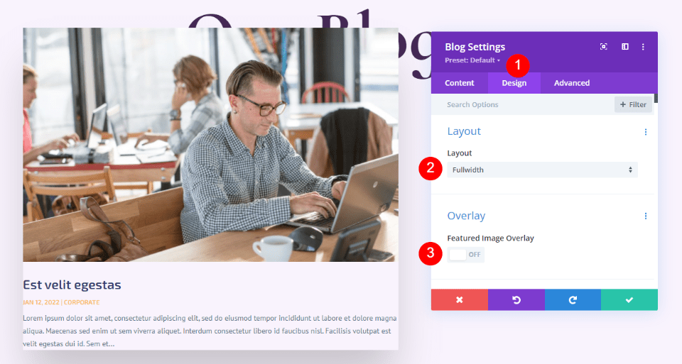
Layout
Next, select the Design tab and choose Fullwidth for the Layout and disable the Featured Image Overlay.
- Layout: Fullwidth
- Featured Image Overlay: Off

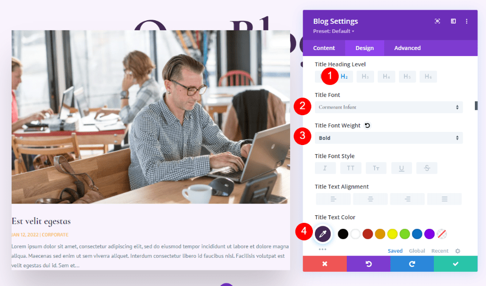
Title Text
Scroll down to Title Text. Select H2 and choose Cormorant Infant. Select Bold and change the color to #442854.
- Heading Level: H2
- Font: Cormorant Infant
- Weight: Bold
- Color: #442854

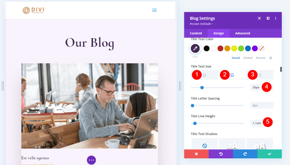
Set the Desktop Font Size to 30px, the Tablet to 20px, and the Phone to 18px. Change the Line Height to 1.1em.
- Size: 30px Desktop, 20px Tablet, 18px Phone
- Title Line Height: 1.1em

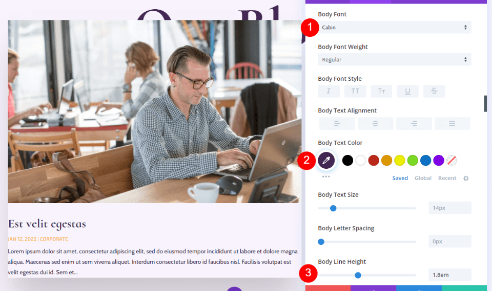
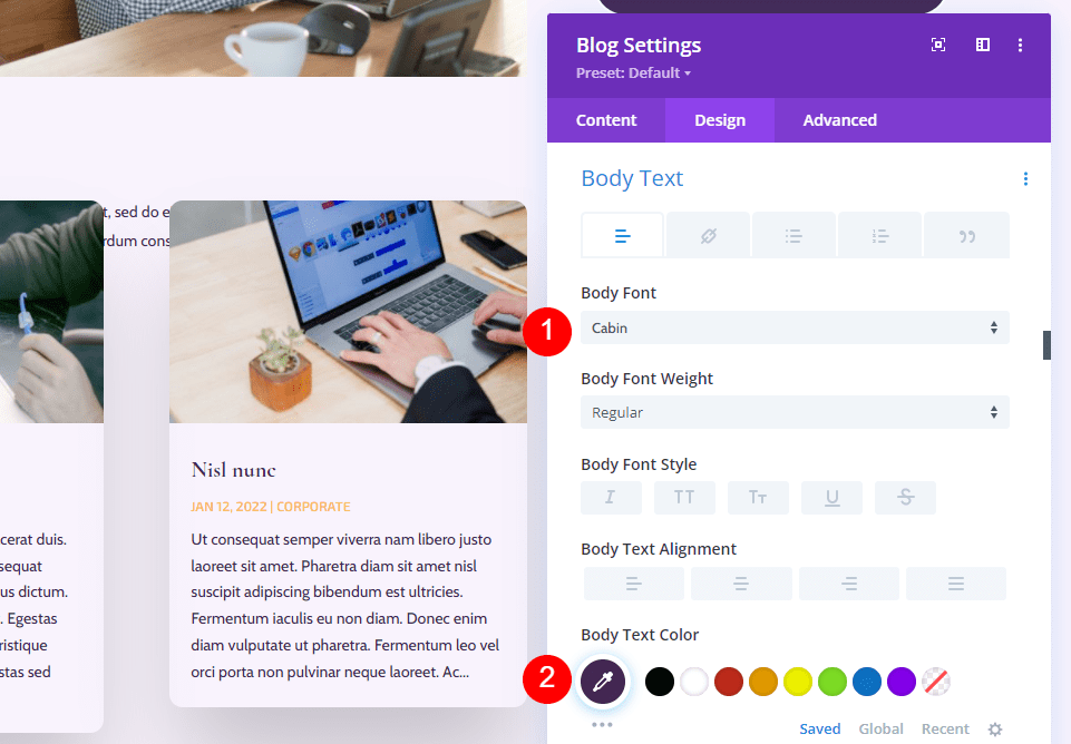
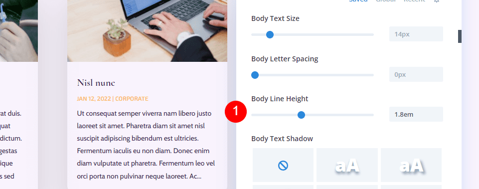
Body Text
Next, scroll to Body Text. Choose Cabin for the font, change the color to #442854, and change the Line Height to 1.8em.
- Font: Cabin
- Color: #442854
- Line Height: 1.8em

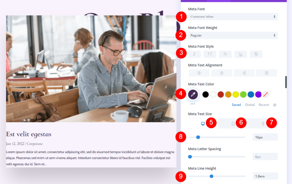
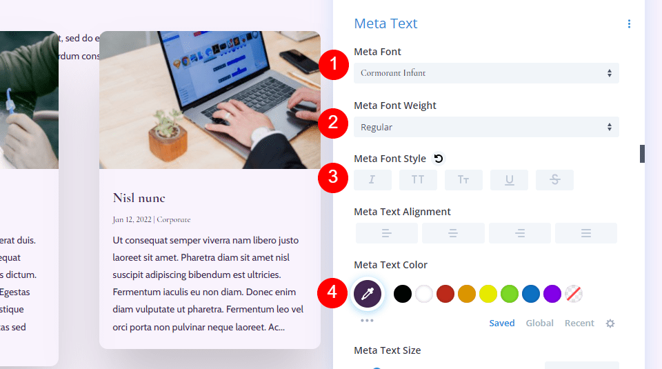
Meta Text
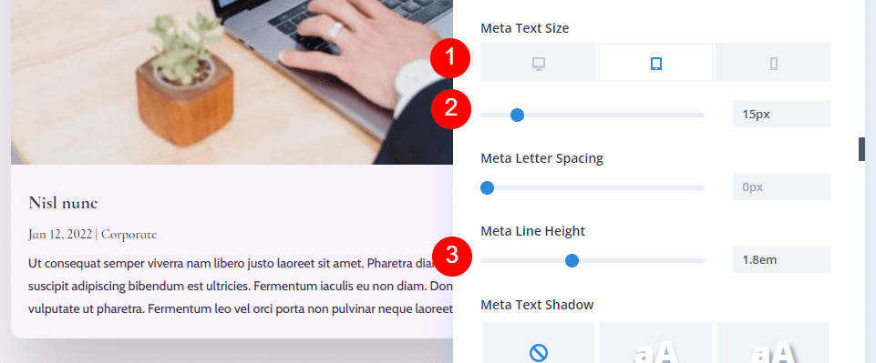
Next, scroll to Meta Text. Change the font to Cormorant Infant, set the Weight to Regular, remove the TT styling, and set the color to #442854. For the Size, set the Desktop to 16px, Tablet to 15px, and Phone to 14px. Change the Line Height to 1.8em.
- Font: Cormorant Infant
- Weight: Regular
- Style: None
- Color: #442854
- Size: Desktop 16px, Tablet 15px, Phone 14px
- Line Height: 1.8em

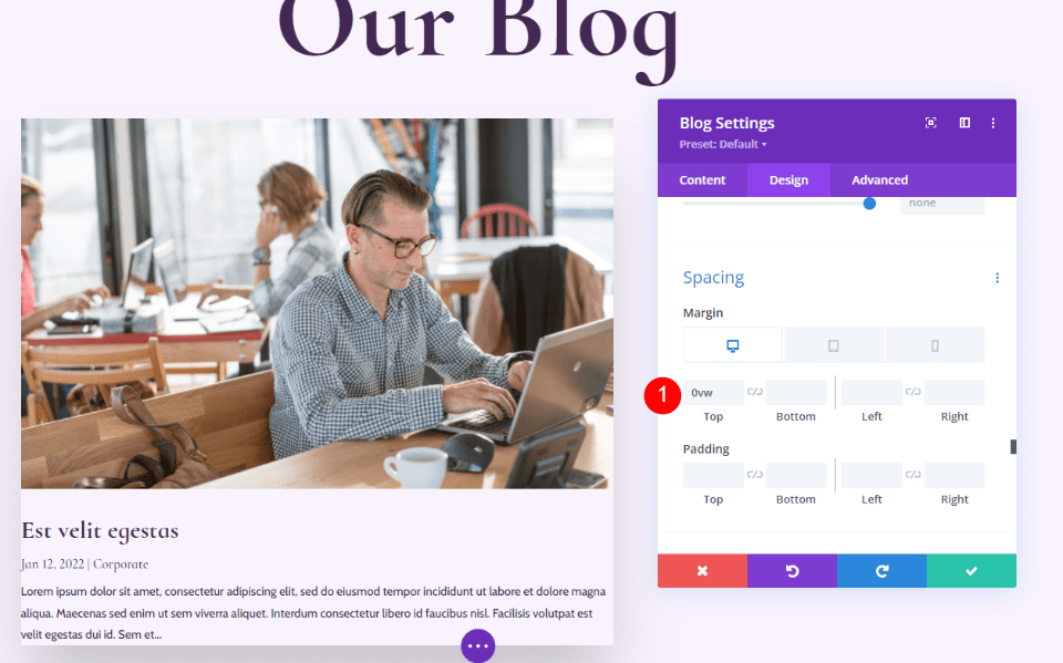
Spacing
Next, scroll down to Spacing and change the Top Margin to 0vw.
- Top Margin: 0vw

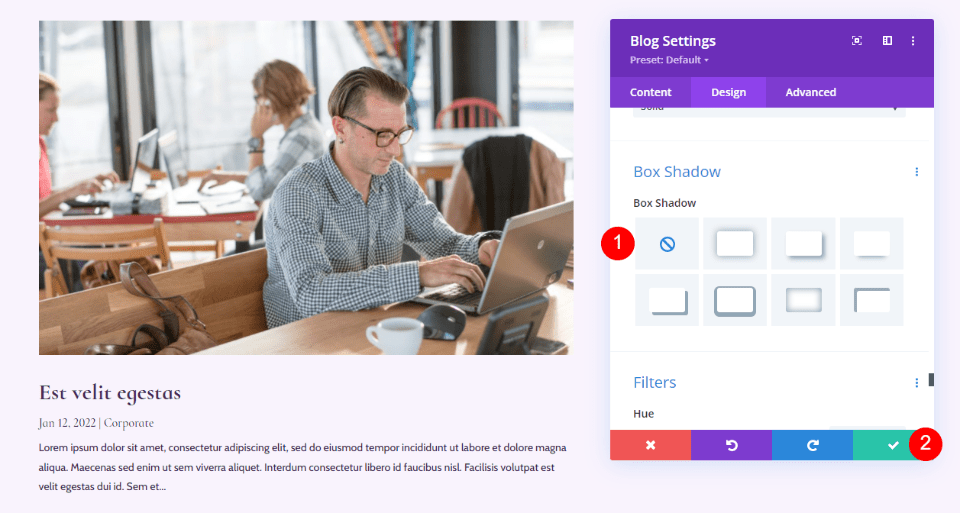
Box Shadow
Finally, scroll to Box Shadow and disable it.
- Box Shadow: Disable
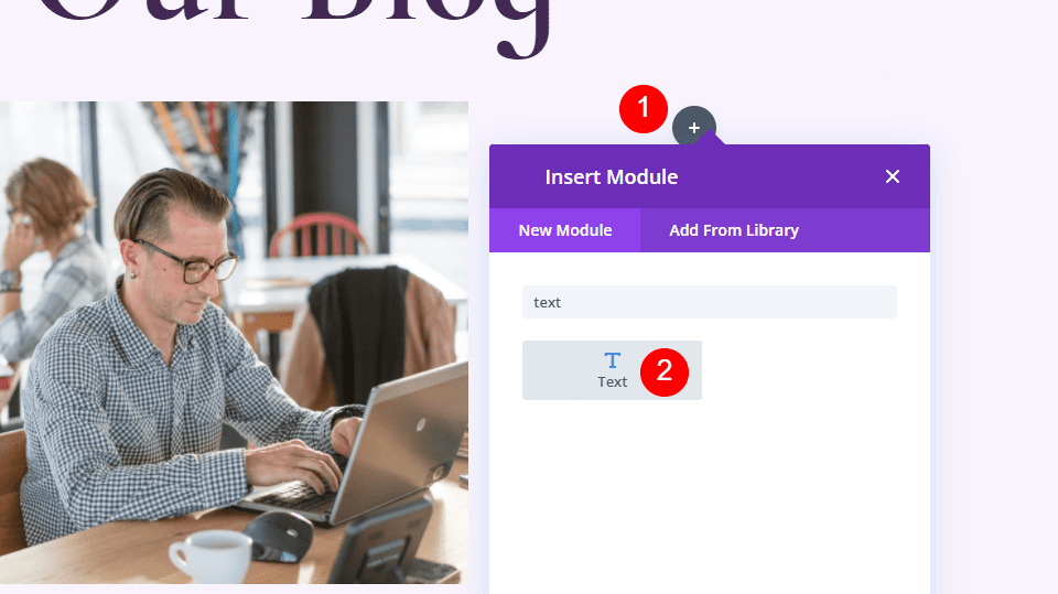
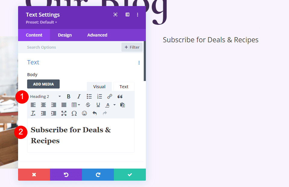
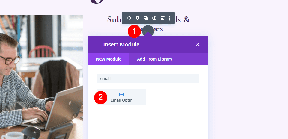
Add and Style the Blog Email Text Module
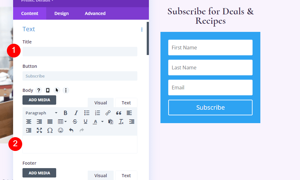
Now, we’ll move on to the right column and create the email CTA. First, add a Text module to the right column. Click the gray plus icon and search for Text.

Content
Select Heading 2 and enter the text Subscribe for Deals & Recipes.
- Font: H2
- Text: Subscribe for Deals & Recipes

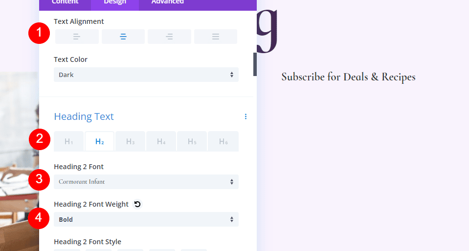
Heading Text
For the Heading Text, select Center Alignment, choose H2, select Cormorant Infant, and set it to Bold.
- Text Alignment: Center
- Heading Text: H2
- Font: Cormorant Infant
- Weight: Bold

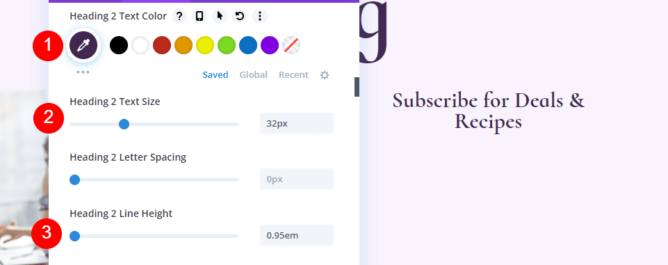
Change the Color to #442854, the Size to 32px, and the Line Height to 0.95em.
- Color: #442854
- Size: 32px
- Line Height: 0.95em

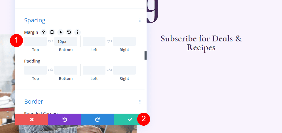
Spacing
Finally, scroll down to Spacing and add 10px to the Bottom Margin. Close the Text module settings.
- Bottom Margin: 10px

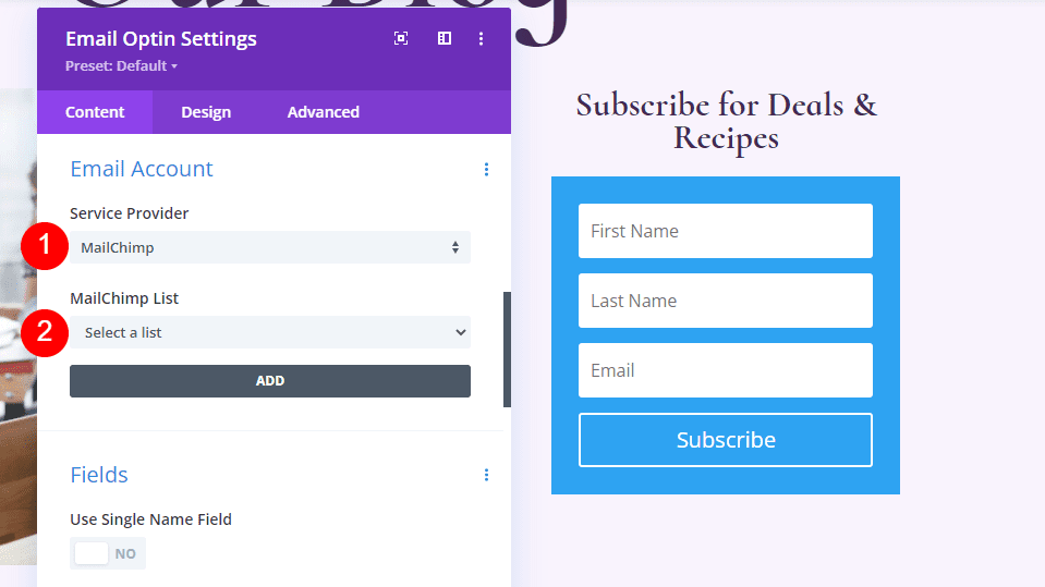
Add and Style the Blog Email Optin Module
Next, we’ll build the email form. Add an Email Optin module under the Text module in the right column.

Content
First, delete the Title and Body text.
- Title: None
- Body Text: None

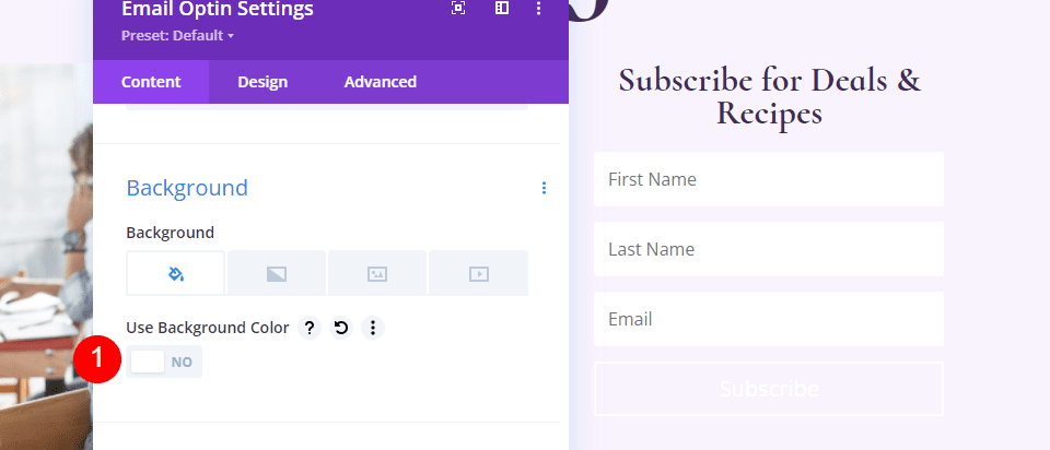
Scroll down to Email Account and add your Service Provider.

Next, scroll to Background and unselect the Background Color.
- Use Background Color: no

Fields
Go to the Design tab and change the Fields Background Color to rgba(255,255,255,0) and the Text color to #442854.
- Background Color: rgba(255,255,255,0)
- Fields Text Color: #442854
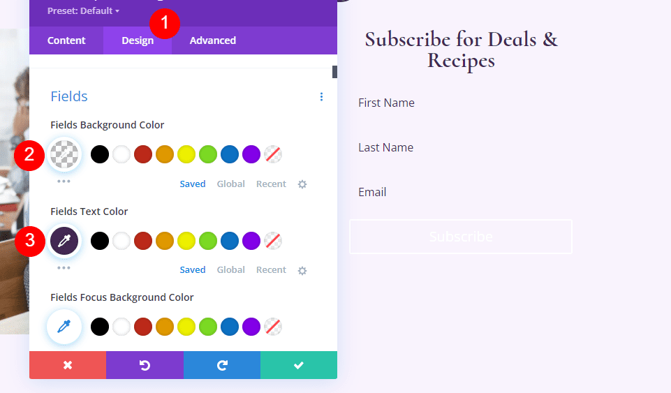

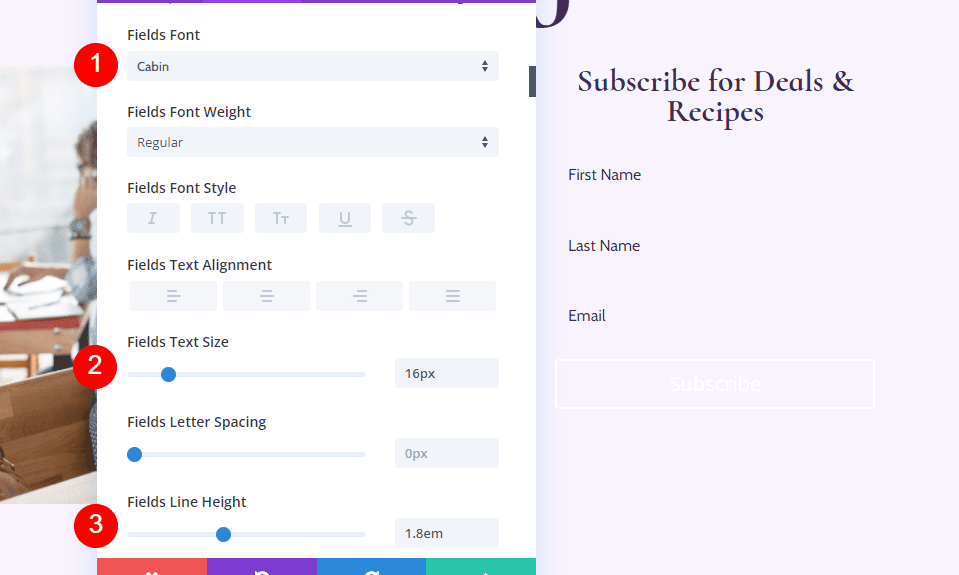
Scroll down to the Font options and change the font to Cabin, the Size to 16px, and the Line Height to 1.8em.
- Fields Font: Cabin
- Size: 16px
- Line Height: 1.8em

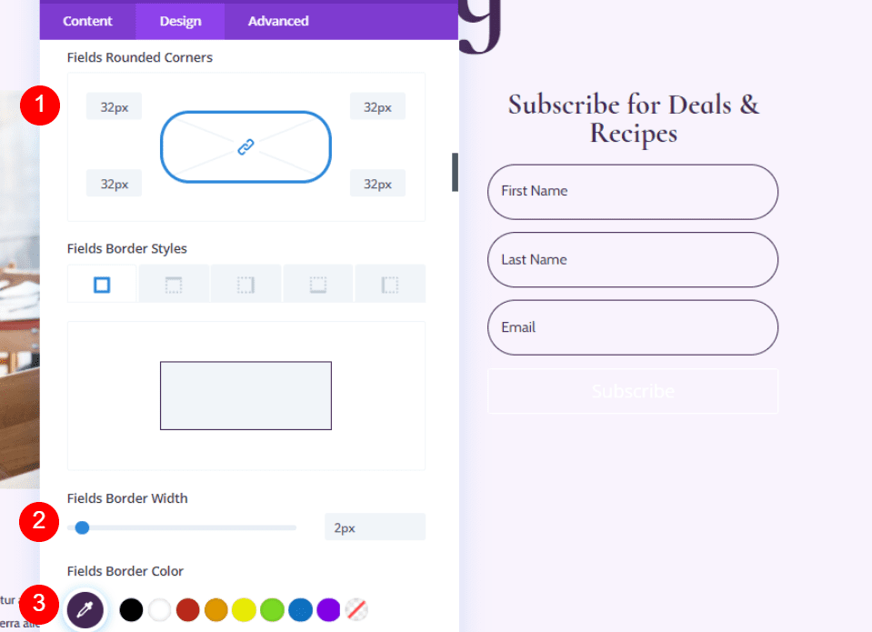
Next, adjust the Fields Rounded Corner to 32px, the Border Width to 2px, and change the Border Color to #442854.
- Fields Rounded Corners: 32px
- Border Width: 2px
- Border Color: #442854

Button
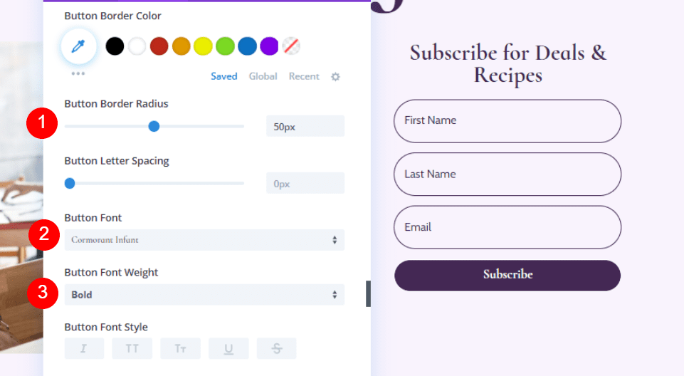
Scroll down to Button and select Use Custom Styles for Button. Change the size to 18ps, the Button Color to white, and the Button Background Color to #442854.
- Use Custom Styles for Button: Yes
- Size: 18px
- Color: #ffffff
- Button Background: #442854
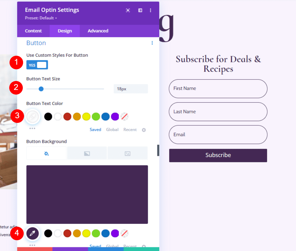

Change the Border Radius to 50px, the font to Cormorant Infant, and make the Weight Bold.
- Border Radius: 50px
- Font: Cormorant Infant
- Weight: Bold

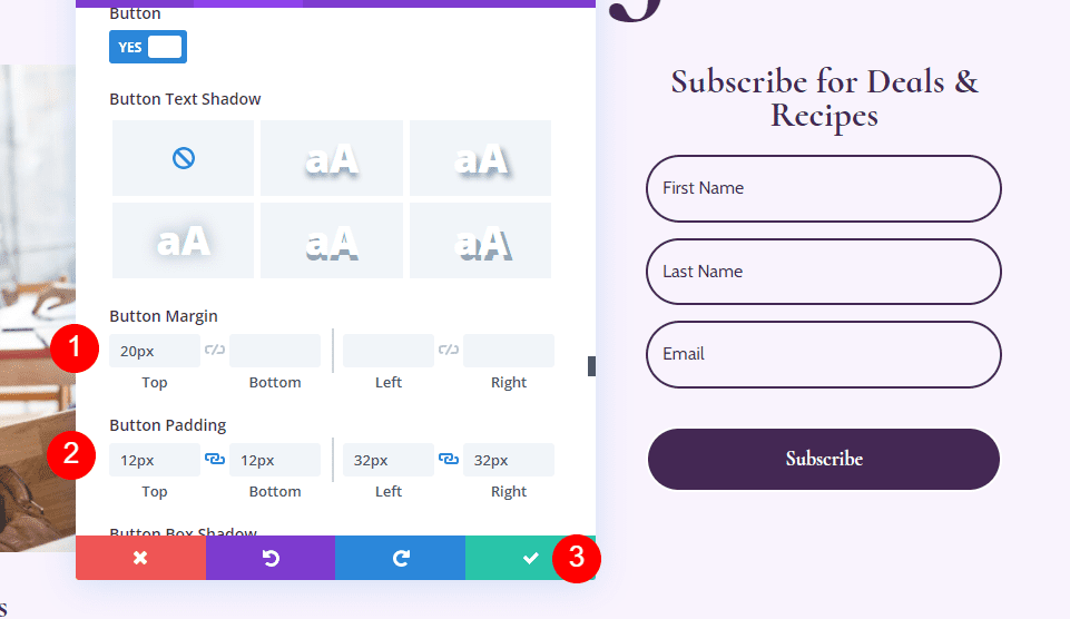
Lastly, let’s add some Button Margin and Padding. Enter 20px for the Top Margin, 12px for the Top and Bottom Padding, and 32px for the Left and Right Padding. Close the Email Optin settings.
- Button Top Margin: 20px
- Top, Bottom Padding: 12px
- Left, Right Padding: 32px

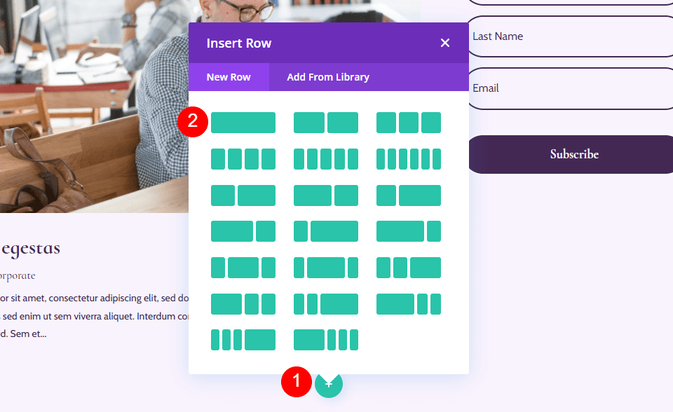
Add New Row for the Blog Page Blog Listing
Now, we’ll build the Blog Listing for the blog page. First, add a new single-column Row under our Hero Row.

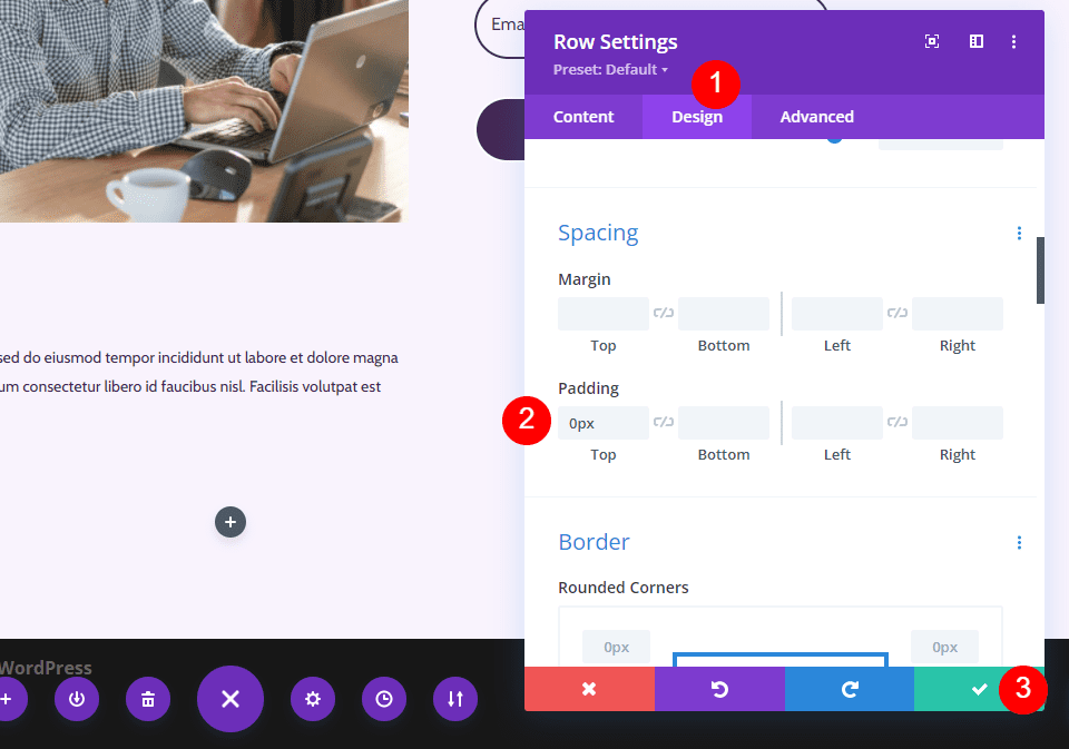
Blog Listing Row Settings
Go to the Design tab and add 0px to the Top Padding. Close the Row settings.
- Top Padding: 0px

Add a Blog Module to Your Row
Add a Blog module to your new Row by clicking the gray plus icon and clicking on Blog.

Style the Blog Feed
Let’s style the feed for the Blog page.
Blog Feed Content
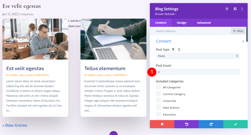
Open the Blog module’s settings and enter 3 for the Post Count. The Post Count allows you to choose the number of posts that displays on the screen.
A lower number, such as 3, allows us to focus on the last few posts and keeps the page smaller. This is a good choice if you don’t post often, or you want to keep the page cleaner. Showing more posts, such as 6-9, is a good idea if you want to focus on the blog feed.
- Post Count: 3

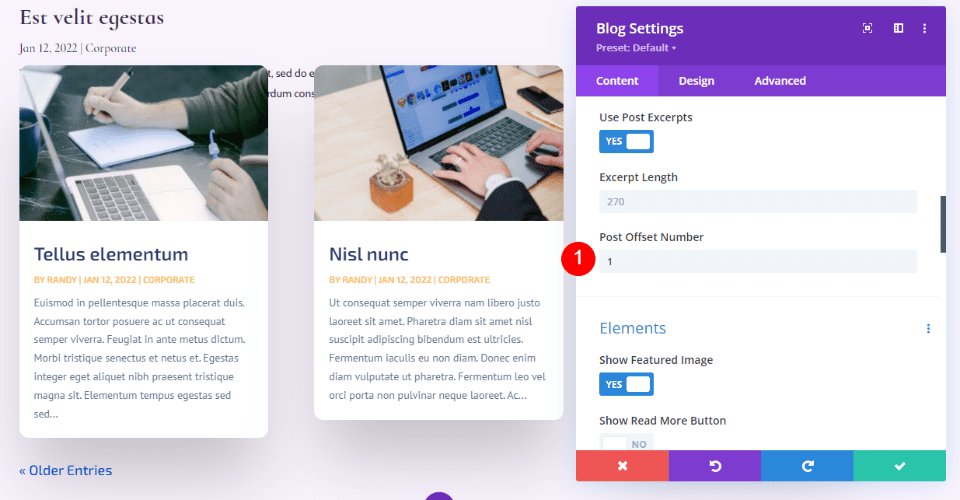
Enter 1 for the offset. This tells Divi to start at the second blog post, which keeps us from displaying the same post that’s already displayed in the featured blog post Row above this one.
- Post Offset Number: 1

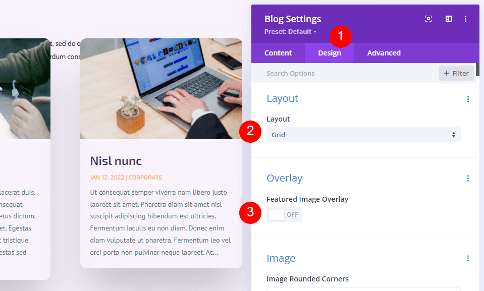
Elements
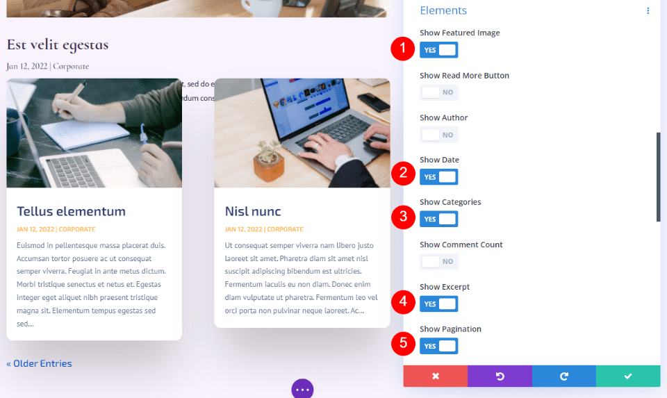
Scroll down to Elements. Enable the Featured Image, Date, Categories Excerpt, and Pagination. Disable the rest.
- Show Featured Image: Yes
- Date: Yes
- Categories: Yes
- Excerpt: Yes
- Pagination: Yes

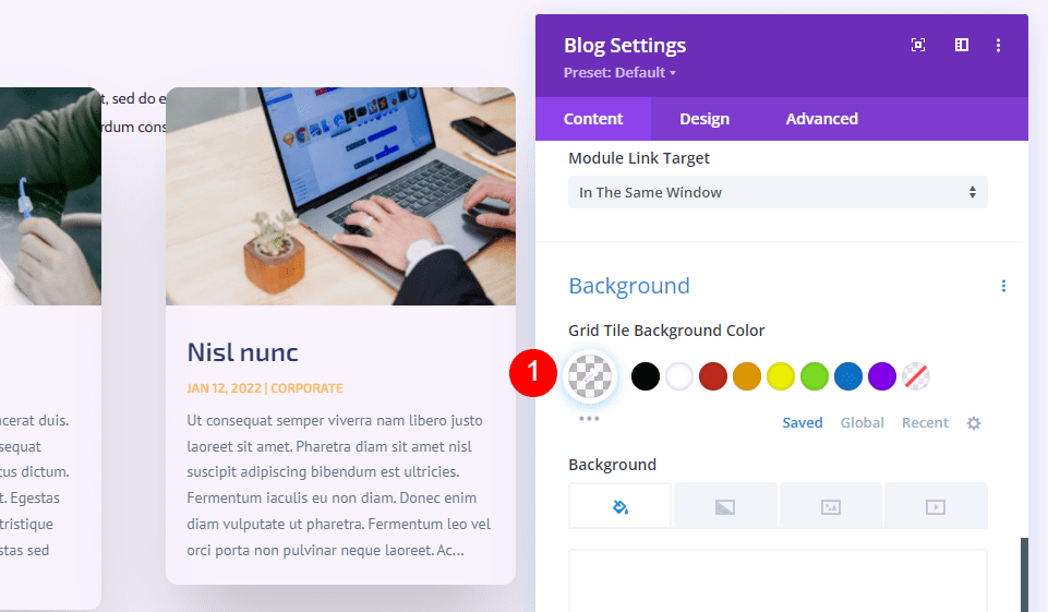
Background
Go to Background and set the Grid Tile Background Color to rgba(255,255,255,0)
- Grid Tile Background Color: rgba(255,255,255,0)

Layout and Overlay
Next, go to the Design tab. Leave the Layout set to Grid. We chose the fullwidth layout for the featured blog post above this one. We’ll use the grid layout for this blog feed, which is the default option. Disable the Featured Image Overlay.
- Layout: Grid
- Featured Image Overlay: Off

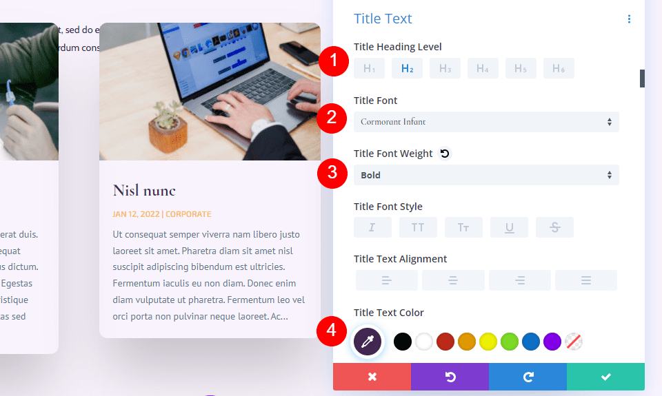
Title Text
For the Title Text, select H2. Choose Cormorant Infant, set it to Bold, and enter #442854 for the Color.
- Heading Level: H2
- Font: Cormorant Infant
- Weight: Bold
- Color: #442854

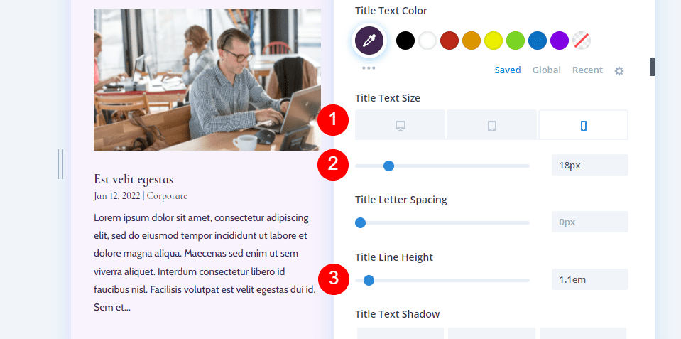
Choose 20px for the Desktop Text Size. Select the Phone icon and set it to 18px. Set the Line Height to 1.1em.
- Size: 20px Desktop, 18px Phone
- Line Height: 1.1em

Body Text
Scroll to Body Text and choose Cabin. Set the Color to #442854.
- Font: Cabin
- Color: #442854

Set the Line Height to 1.8em.
- Line Height: 1.8em

Meta Text
Scroll down to Meta Text and choose Cormorant Infant. Set the Weight to Regular, Style to none, and Color to #442854.
- Font: Cormorant Infant
- Weight: Regular
- Style: None
- Color: #442854

Set the Desktop Size to 16px, the Tablet to 15px, and the Phone 14px. Change the Line Height to 1.8em.
- Size: 16px Desktop, 15px Tablet, 14px Phone
- Line Height: 1.8em

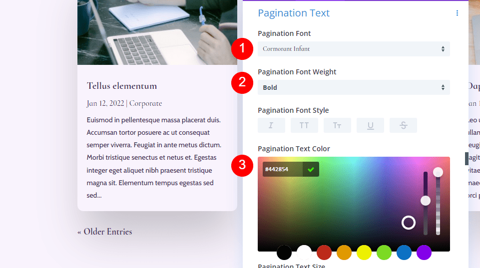
Pagination Text
Now, let’s move to the Pagination Text. For the Font, choose Cormorant Infant, select Bold, and change the color to #442854.
- Font: Cormorant Infant
- Weight: Bold
- Color: #442854

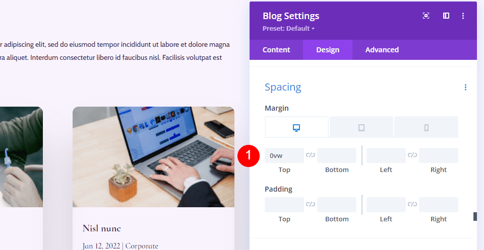
Spacing
Next, we’ll go to Spacing and add 0vw Margin to the Top. This keeps our module from overlapping the previous module.
- Top Margin: 0vw

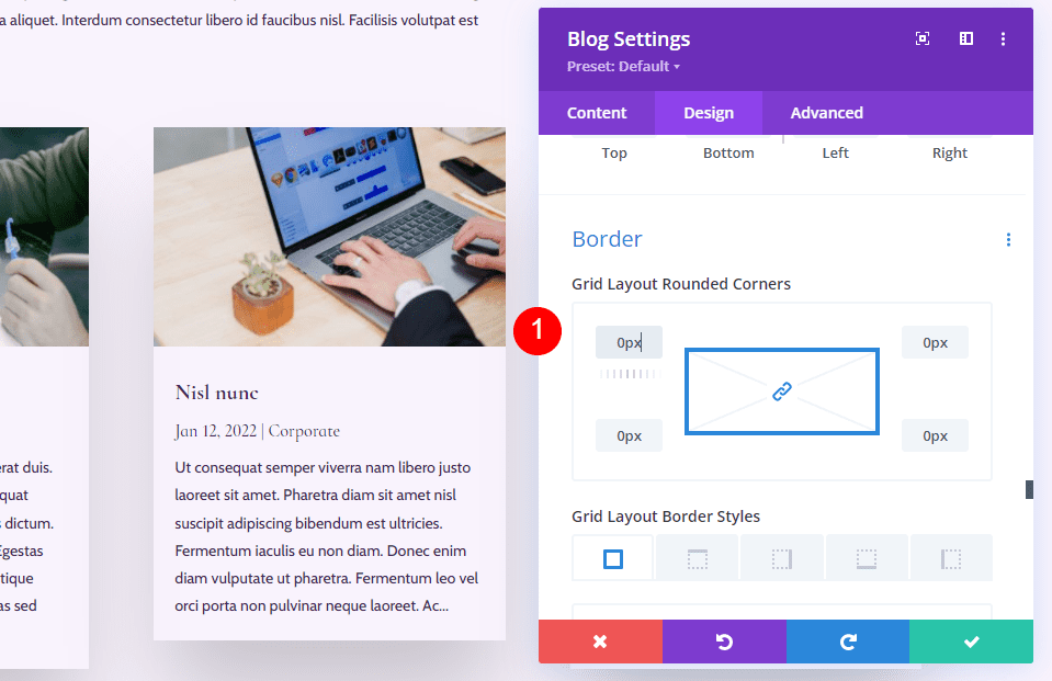
Border
Scroll to Border and enter 0px for all four corners. This gives us our square shape for the card.
- Rounded Corners: 0px

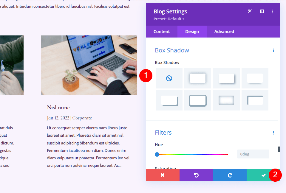
Box Shadow
Finally, scroll to Box Shadow and disable it. Close the Blog settings. The blog section is finished.
- Box Shadow: None

Add New CTA Section to the Blog Page
Next, we’ll create the CTA section of the page. This section includes a fullwidth background image in parallax, contact information, and social follow links.

Add a New Section
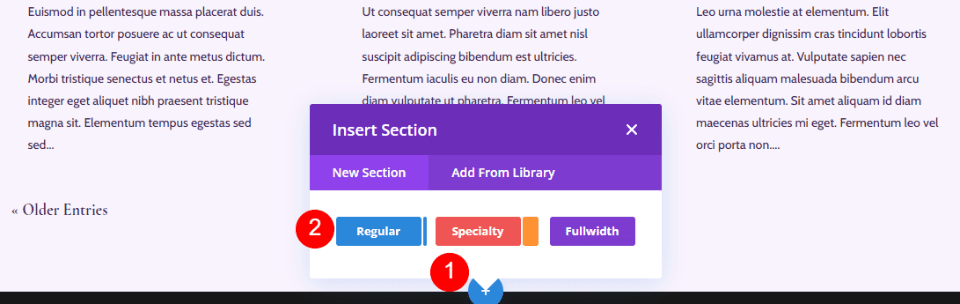
Click the blue icon to add a new Regular Section at the bottom of the page.
- Section: Regular

Style the CTA Section
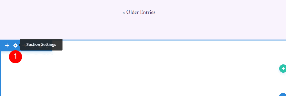
Open the Section’s settings by clicking on its gear icon.

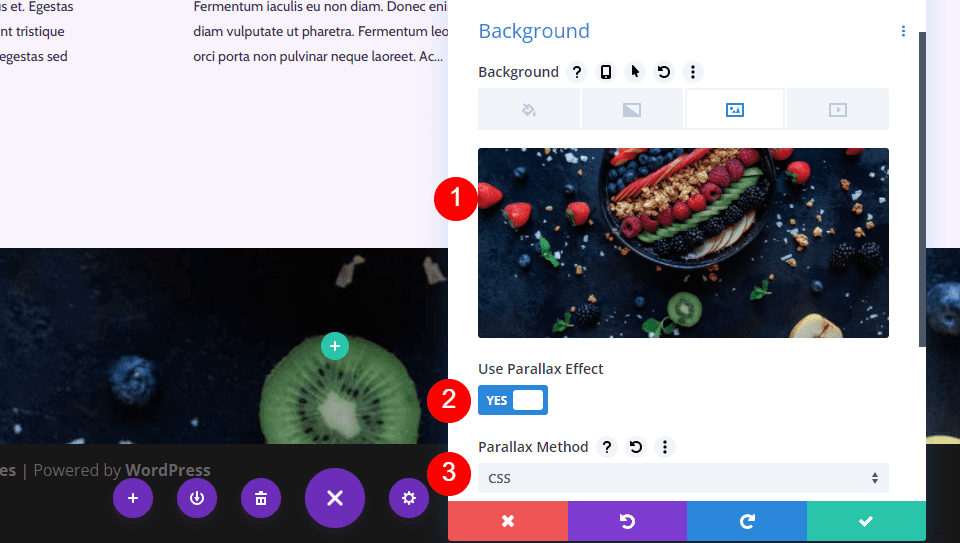
Background
Scroll to Background and choose the Image tab. Click the gray icon labeled Add Background Image.
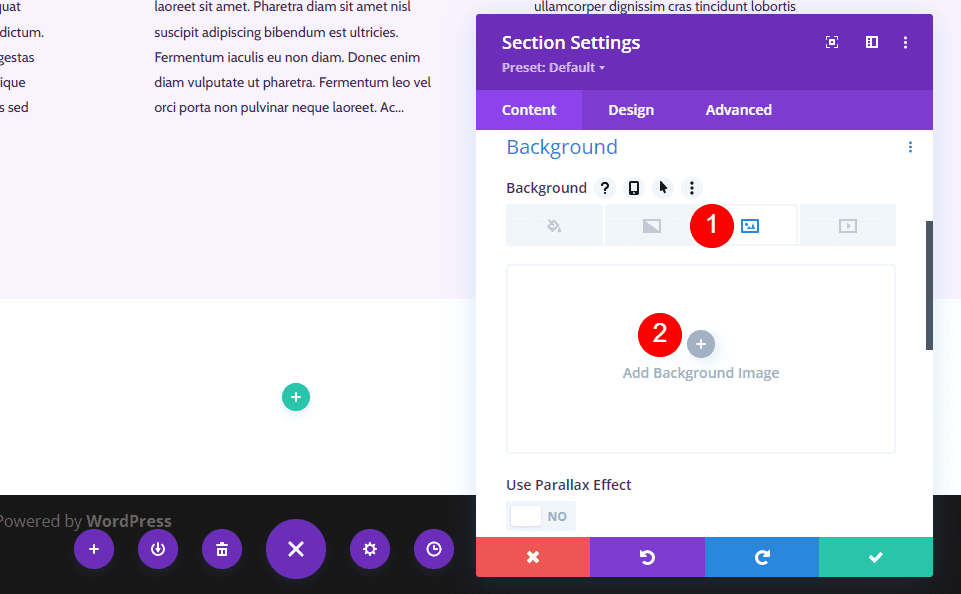

Choose a full-width image from your Media Library. Select Use Parallax Effect and then choose CSS for the Parallax Method.
- Background: Image
- Use Parallax Effect: Yes
- Parallax Method: CSS

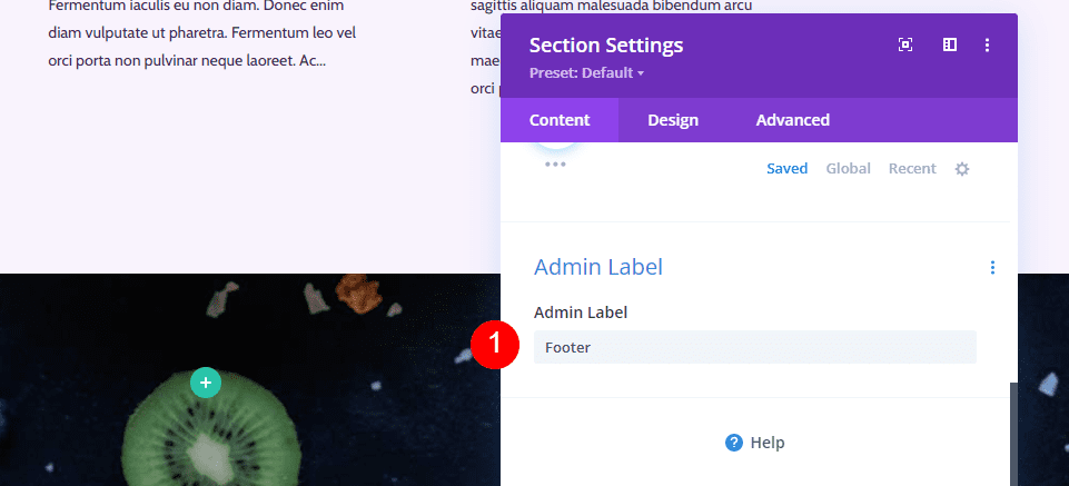
Scroll down to Admin Label and enter Footer into the field. This will help you keep track of the sections.
- Admin Label: Footer

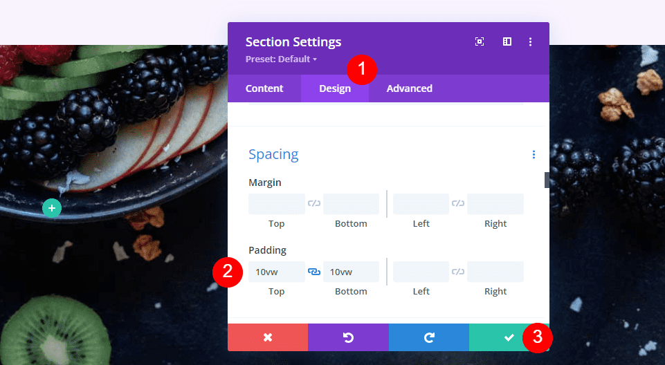
Next, go to the Design tab. Scroll to Spacing and add 10vw to the Top and Bottom Padding. Close the Section settings.
- Padding: 10vw (Top and Bottom)
Add a New CTA Row
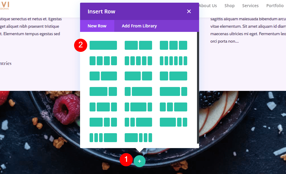
Click on the green plus icon and add a single-column Row for our content.
- Row: One Column

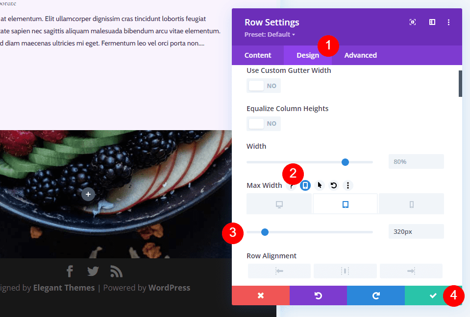
Sizing
Open the Row’s settings and go to the Design tab. Under Sizing, select the Tablet icon under Max Width and enter 320px. This will automatically reflect in the Phone settings. Close the Row settings.
- Max Width: 320px Tablet
Title Text Module
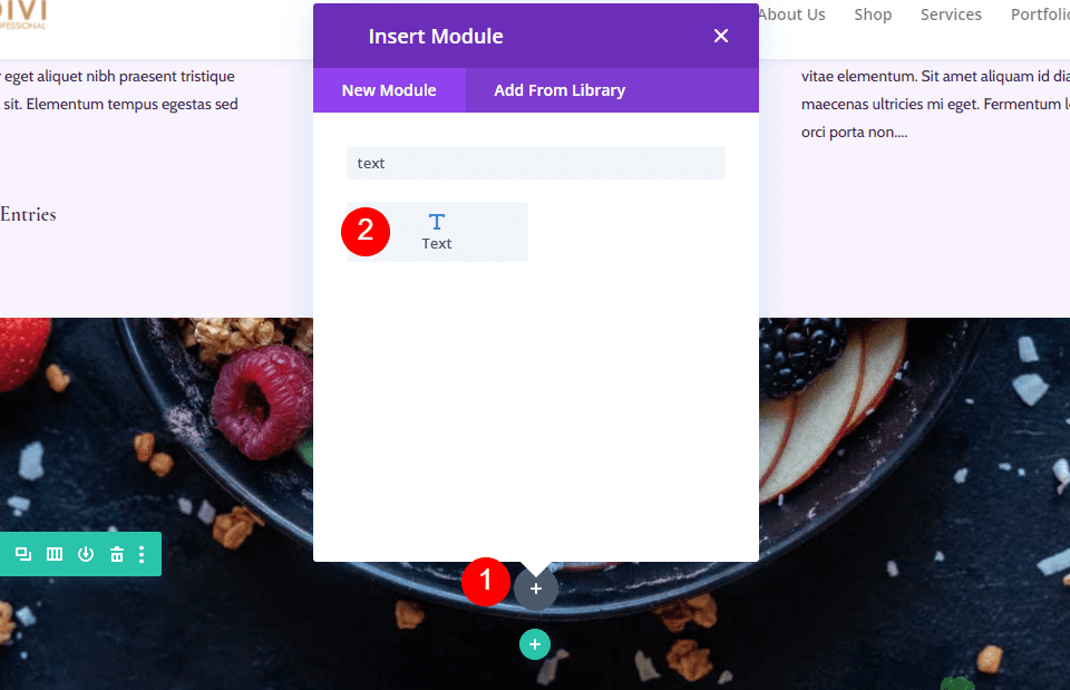
Our CTA is introduced with a title. To create this, add a Text module to the Row.

Style the Title Text
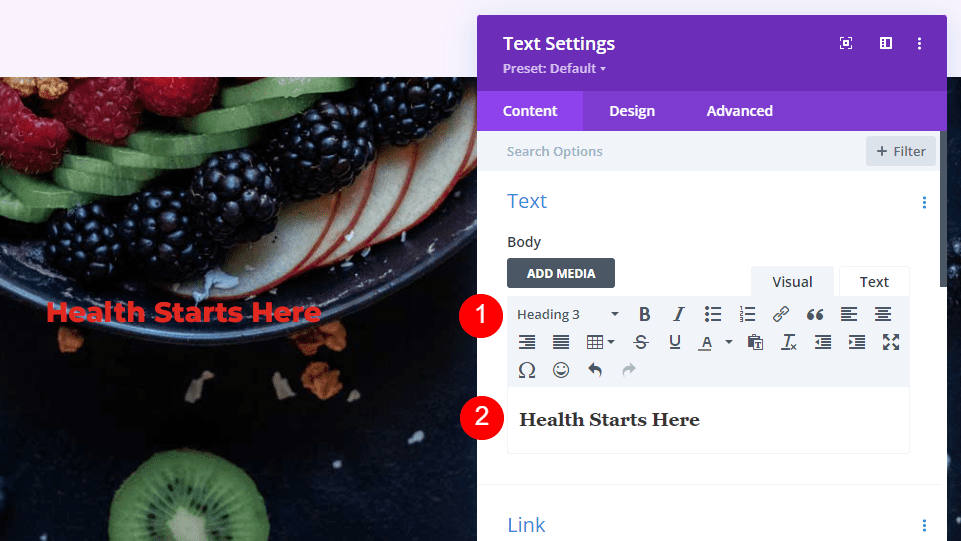
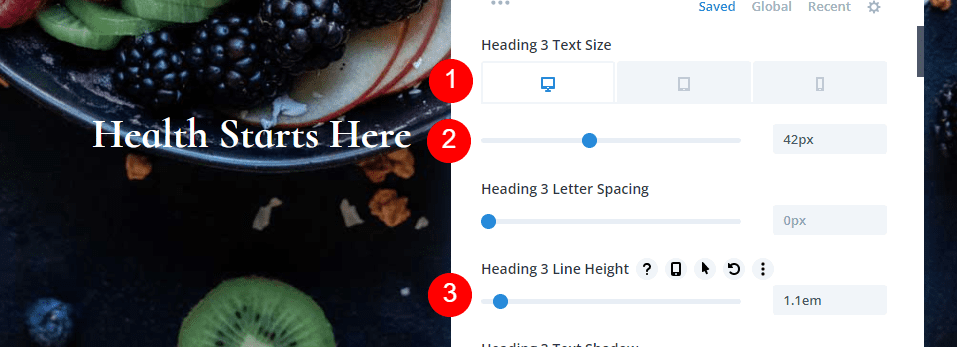
Add your title and change the font to Heading 3.
- Font: H3
- Text: Health Starts Here

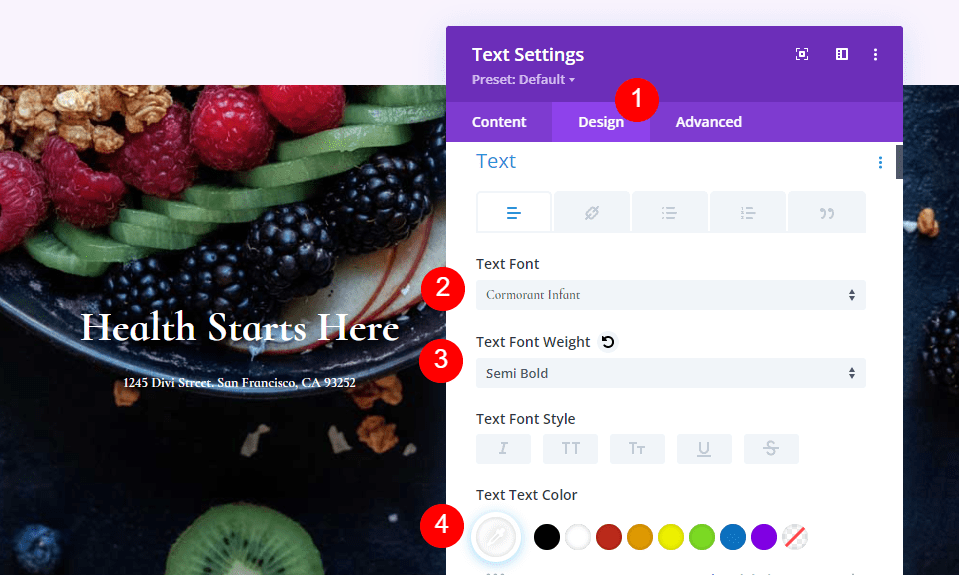
Heading Text
Go to the Design tab and scroll down to Heading Text. Choose center for the Alignment, select H3, choose Cormorant Infant, set it to Bold, and choose white for the Color.
- Alignment: Center
- Heading Text: H3
- Font: Cormorant Infant
- Weight: Bold
- Color: #ffffff
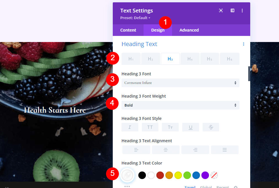
Change the Desktop Size to 42px, the Tablet Size to 20px, and the Phone Size to 16px. Select 1.1em for the Line Height.
- Size: 42px Desktop, 20px Tablet, 16px Phone
- Line Height: 1.1em

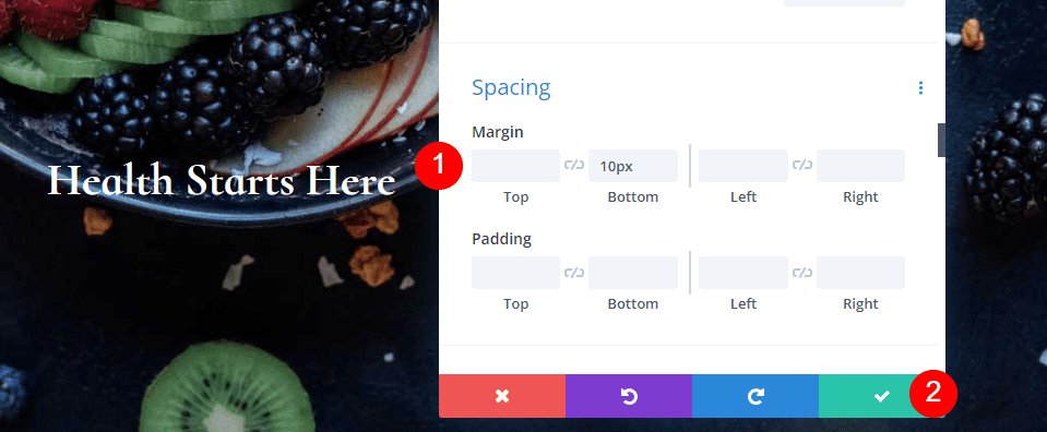
Spacing
Finally, scroll to Spacing and add 10px to the Bottom Margin. Close the module’s settings.
- Bottom Margin: 10px

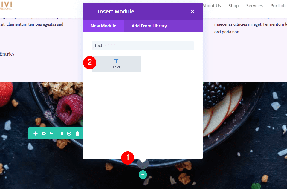
Address Text Module
Add another Text module under the CTA Title for your physical address.

Style the Address Text Module
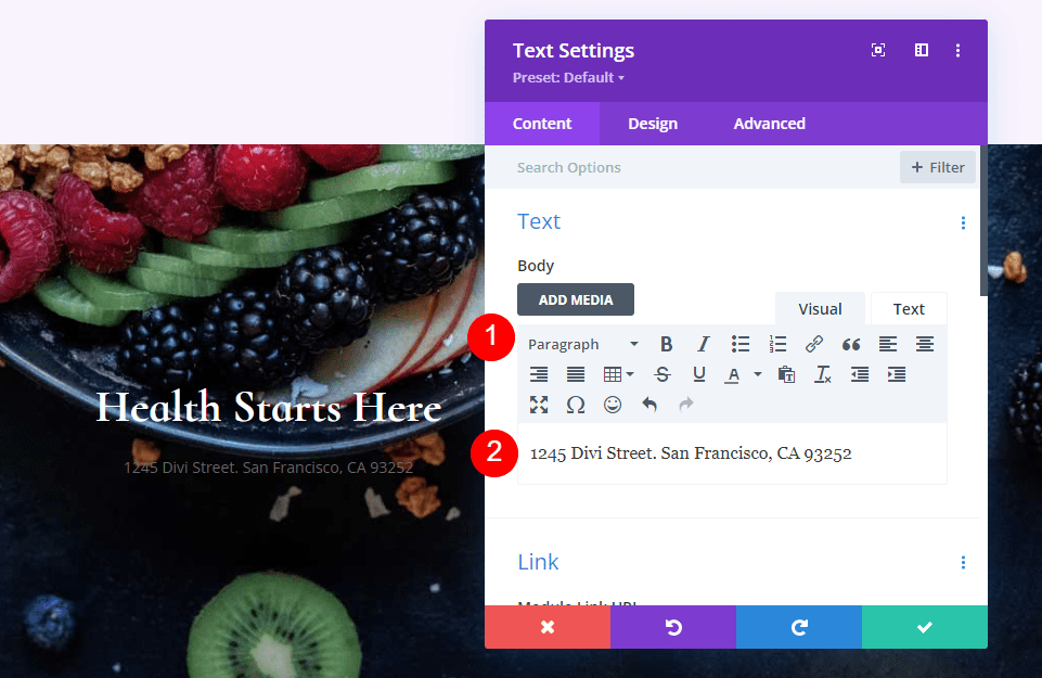
Address Text
Add your address as Paragraph text.
- Style: Paragraph
- Text: your address

Paragraph Text
Next, go to Text in the Design tab and choose Cormorant Infant, semi bold, and set it to white.
- Font: Cormorant Infant
- Weight: Semi Bold
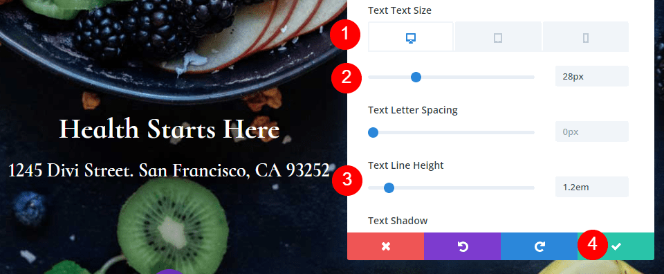
- Color: #ffffff
For the Size, set the Desktop to 28px, Tablet to 20px, and Phone to 16px. Change the Line Height to 1.2em and close the module’s settings.
- Size: 28px Desktop, 20px Tablet, 16px Phone
- Line Height: 1.2em

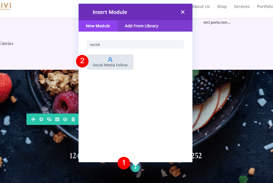
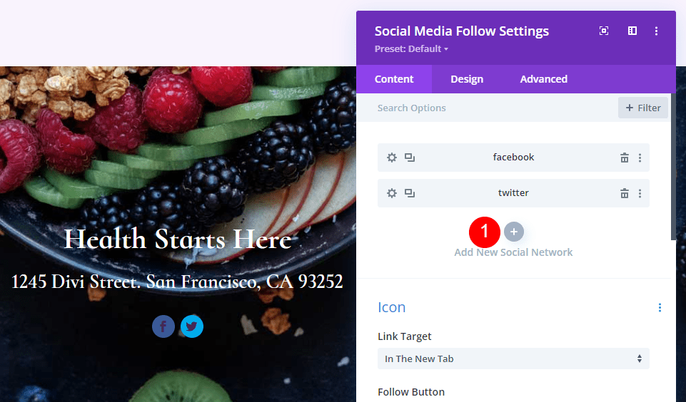
Add the Social Media Follow Module
Our final module is the Social Media Follow module. Add it to the bottom of the Row.

Style The Social Media Follow Module
We’ll start with the Design tab this time. Select Center for the Module Alignment and change the Icon Color to #442854.
- Module Alignment: Center
- Icon Color: #442854
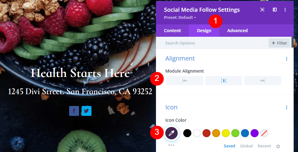

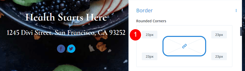
Scroll to Border and add 23px for the Rounded Corners.
- Rounded Corner: 23px

Add and Style Your Social Networks
Now, go back to the Content tab and add all the social networks you want to include. Click the gray plus icon. To style them, select the gear.

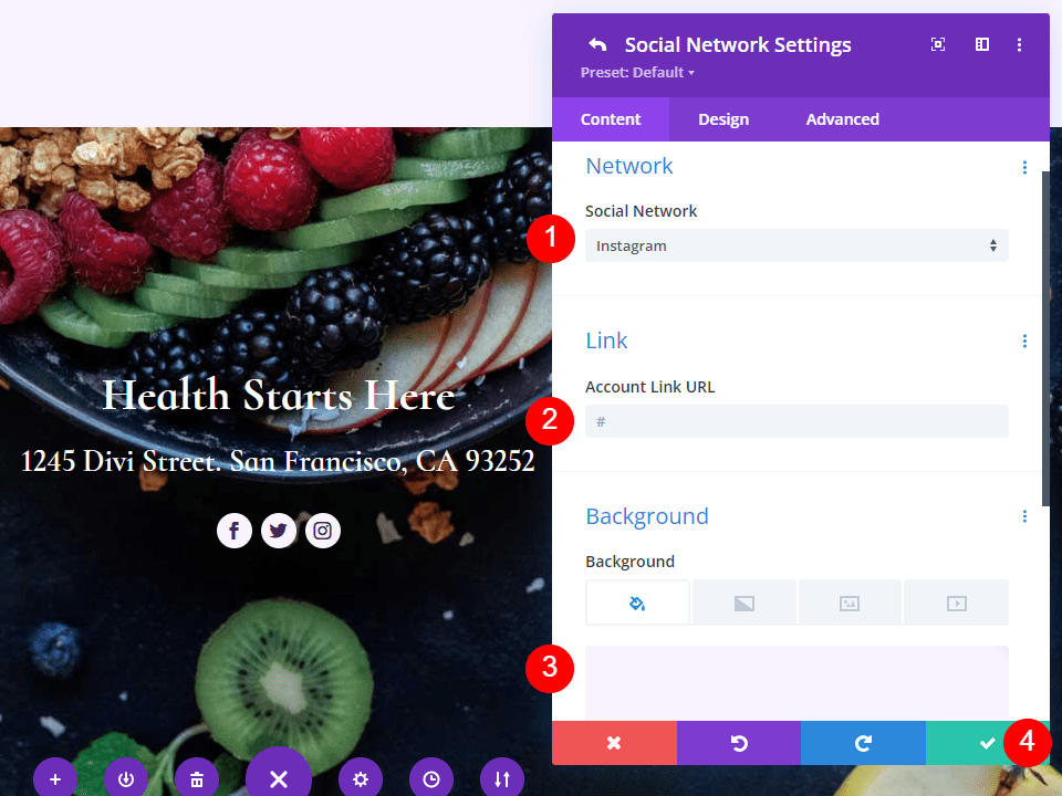
Open the settings for each of your Social Networks, choose the network, and add the link to your account. Set the Background Color to #f9f3fd. Close the submodule’s settings.
- Social Network: your choice
- Account Link URL: your link
- Background Color: #f9f3fd

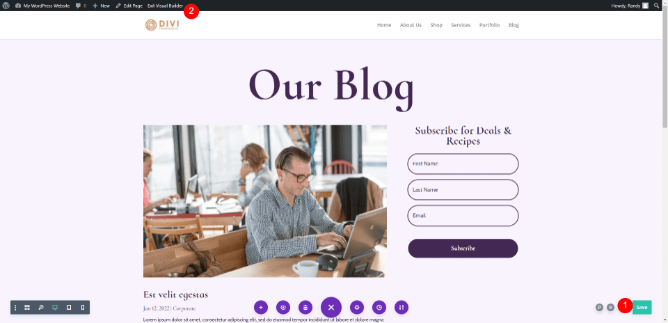
Save the Blog Page & Exit the Visual Builder
Finally, save the page in the lower right corner and select Exit Visual Builder at the top of the page. You’re ready to view your work.
Blog Page Preview
Here are our results.
Preview Desktop
Preview Mobile
Ending Thoughts
That’s our look at how to build a blog page with Divi. The Divi Builder makes it easy to create interesting layouts and there are several ways each of the modules can be used. As this tutorial explored, it’s possible to use multiple versions of the Blog module on the same page to display the blog feed in different ways.
We want to hear from you. Have you built your own blog page with Divi? Let us know about your experience in the comments.
The post How to Build a Blog Page with Divi’s Blog Module appeared first on Elegant Themes Blog.