


Leading customers through a successful checkout process is a challenging goal for every online store. So it helps to optimize your website’s checkout process to make it easier for customers. Since navigation plays a crucial role in the checkout process, we may want to start there. Creating a custom checkout process navigation menu is a great way to boost UX and sales conversion. It helps users go where they want quickly. And, it also can be used to spotlight where they are (and where they’re going) in the process.
In this tutorial, we are going to show you how to design a checkout process navigation menu in Divi. You will be able to use this custom menu to boost the UX on the pages most crucial to the checkout process (shop, cart, checkout, etc.). This kind of menu has been used in our free WooCommmerce Cart and Checkout Page Template Sets as well.
Let’s get started.
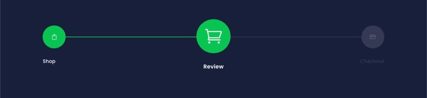
Sneak Peek
Here is a quick look at the design we’ll build in this tutorial.


You can also check out the live demo of this checkout process navigation menu design.
Download the Layout for FREE
To lay your hands on the layout from this tutorial, you will first need to download it using the button below. To gain access to the download you will need to subscribe to our Divi Daily email list by using the form below. As a new subscriber, you will receive even more Divi goodness and a free Divi Layout pack every Monday! If you’re already on the list, simply enter your email address below and click download. You will not be “resubscribed” or receive extra emails.
@media only screen and ( max-width: 767px ) {.et_bloom .et_bloom_optin_1 .carrot_edge.et_bloom_form_right .et_bloom_form_content:before { border-top-color: #ffffff !important; border-left-color: transparent !important; }.et_bloom .et_bloom_optin_1 .carrot_edge.et_bloom_form_left .et_bloom_form_content:after { border-bottom-color: #ffffff !important; border-left-color: transparent !important; }
}.et_bloom .et_bloom_optin_1 .et_bloom_form_content button { background-color: #f92c8b !important; } .et_bloom .et_bloom_optin_1 .et_bloom_form_content .et_bloom_fields i { color: #f92c8b !important; } .et_bloom .et_bloom_optin_1 .et_bloom_form_content .et_bloom_custom_field_radio i:before { background: #f92c8b !important; } .et_bloom .et_bloom_optin_1 .et_bloom_border_solid { border-color: #f7f9fb !important } .et_bloom .et_bloom_optin_1 .et_bloom_form_content button { background-color: #f92c8b !important; } .et_bloom .et_bloom_optin_1 .et_bloom_form_container h2, .et_bloom .et_bloom_optin_1 .et_bloom_form_container h2 span, .et_bloom .et_bloom_optin_1 .et_bloom_form_container h2 strong { font-family: “Open Sans”, Helvetica, Arial, Lucida, sans-serif; }.et_bloom .et_bloom_optin_1 .et_bloom_form_container p, .et_bloom .et_bloom_optin_1 .et_bloom_form_container p span, .et_bloom .et_bloom_optin_1 .et_bloom_form_container p strong, .et_bloom .et_bloom_optin_1 .et_bloom_form_container form input, .et_bloom .et_bloom_optin_1 .et_bloom_form_container form button span { font-family: “Open Sans”, Helvetica, Arial, Lucida, sans-serif; } p.et_bloom_popup_input { padding-bottom: 0 !important;}


Download For Free
Join the Divi Newsletter and we will email you a copy of the ultimate Divi Landing Page Layout Pack, plus tons of other amazing and free Divi resources, tips and tricks. Follow along and you will be a Divi master in no time. If you are already subscribed simply type in your email address below and click download to access the layout pack.
You have successfully subscribed. Please check your email address to confirm your subscription and get access to free weekly Divi layout packs!
To import the section layout to your Divi Library, navigate to the Divi Library.
Click the Import button.
In the portability popup, select the import tab and choose the download file from your computer.
Then click the import button.


Once done, the layout(s) will be available in the Divi Builder.
This Checkout Process Navigation Menu design was featured in one of our FREE cart & checkout page template sets for Divi.
Let’s get to the tutorial, shall we?
What You Need to Get Started


To get started, you will need to do the following:
- If you haven’t yet, install and activate the Divi Theme.
- Create a new page in WordPress and use the Divi Builder to edit the page on the front end (visual builder).
- Choose the option “Build From Scratch”.
After that, you will have a blank canvas to start designing in Divi.
How to Design a Checkout Process Navigation Menu for Your Cart or Checkout Page in Divi
Creating the Section and Row
To start, let’s add a background color to the existing regular section. Open the section settings and add the following:
- Background Color: #171f3a
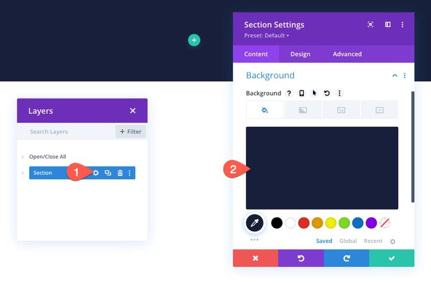

Next, add a one-column row to the section.
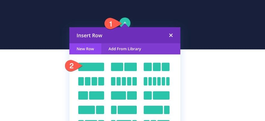

Creating the Checkout Process Navigation Links
To create the checkout process navigation links, we are going to use three blurb modules that link to the Shop page, the Cart page, and the Checkout page.
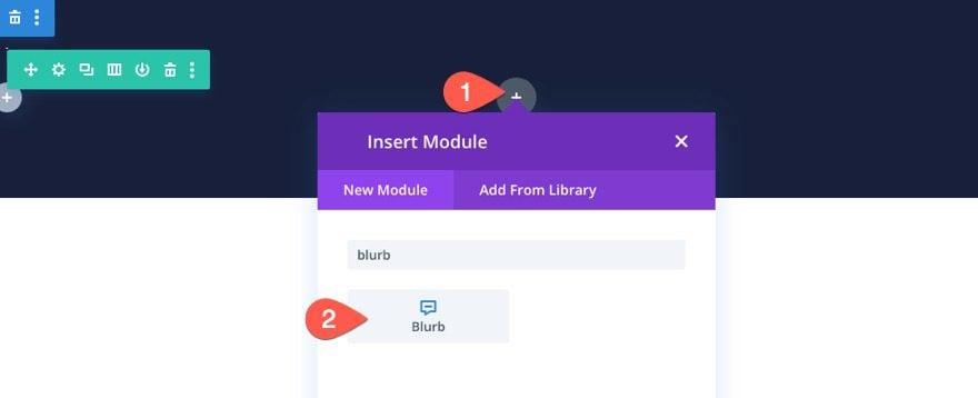
Adding the Shop Navigation Link
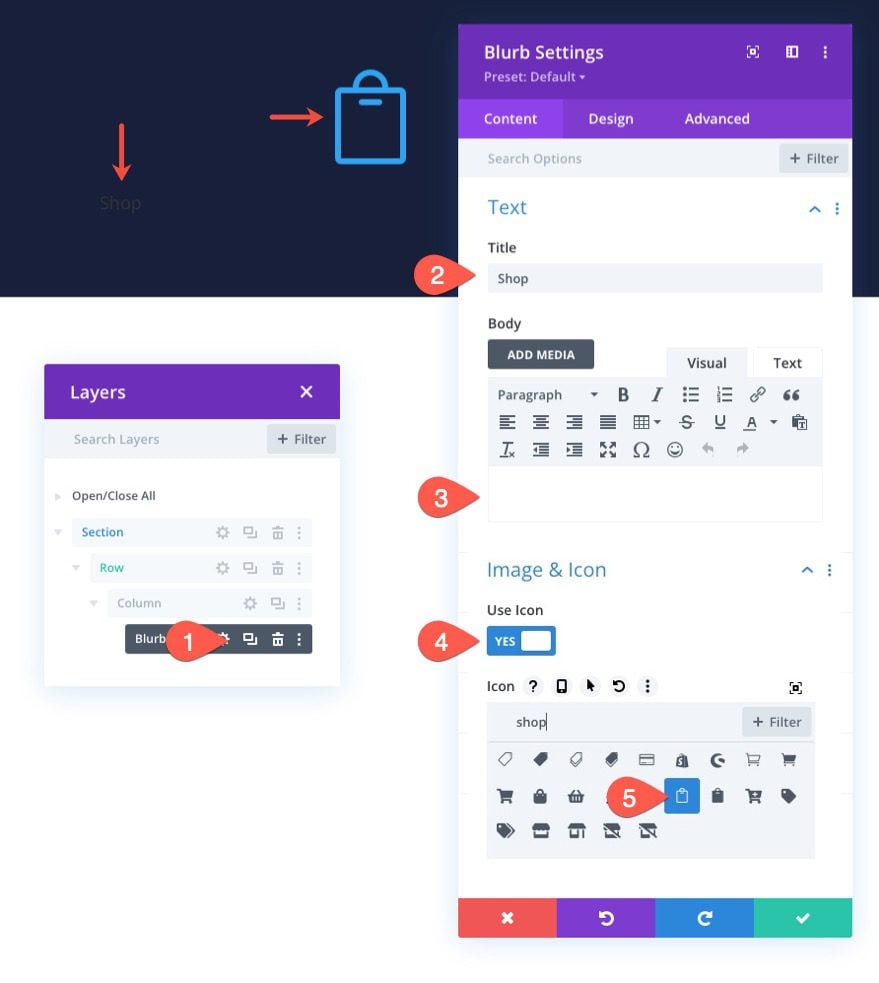
To create the shop navigation link, add a new blurb module to the column.

Content Settings
In the blurb settings, update the content as follows:
- Title: Shop
- Use Icon: YES
- Icon: see screenshot
- Module Link URL: link for the shop page

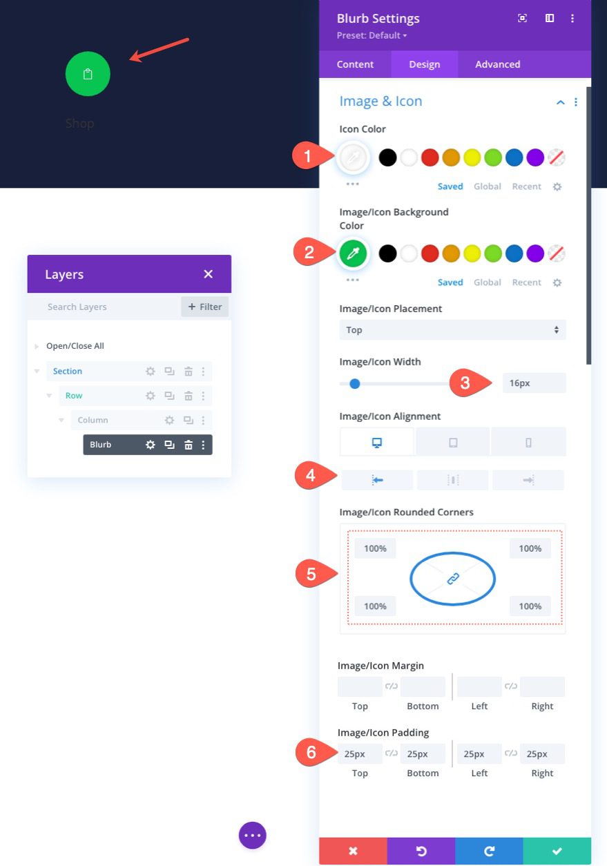
Design Settings
Under the design tab, update the following:
- Icon Color: #fff
- Image/Icon Background Color: #08c451
- Image/Icon Width: 16px
- Image/Icon Alignment: Left (desktop), Center (tablet and phone)
- Image/Icon Rounded Corners: 100%
- Image/Icon Padding: 25px (top, bottom, left, right)

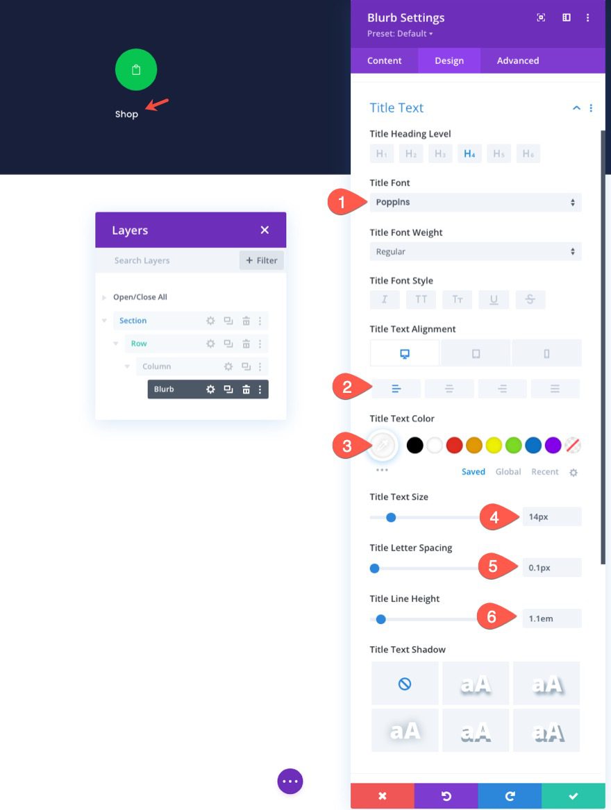
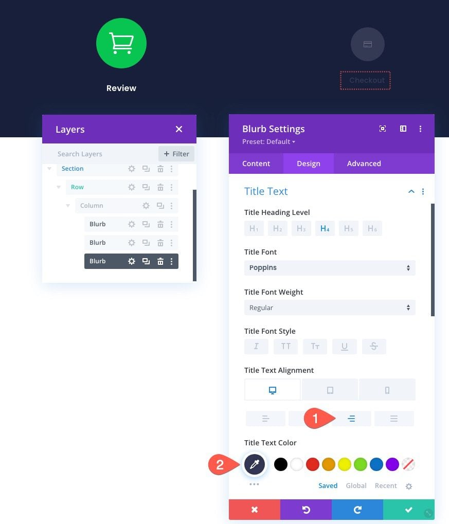
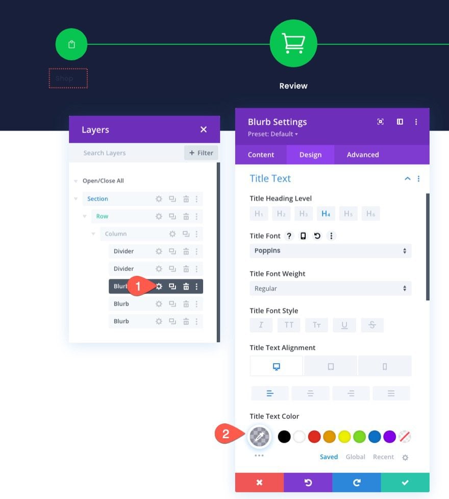
After the icon design is complete, update the title text as follows:
- Title Font Poppins
- Title Text Alignment: left (desktop), center (tablet and phone)
- Title Text Color: #fff
- Title Text Size: 14px
- Title Letter Spacing 0.1px
- Title Line Height: 1.1em

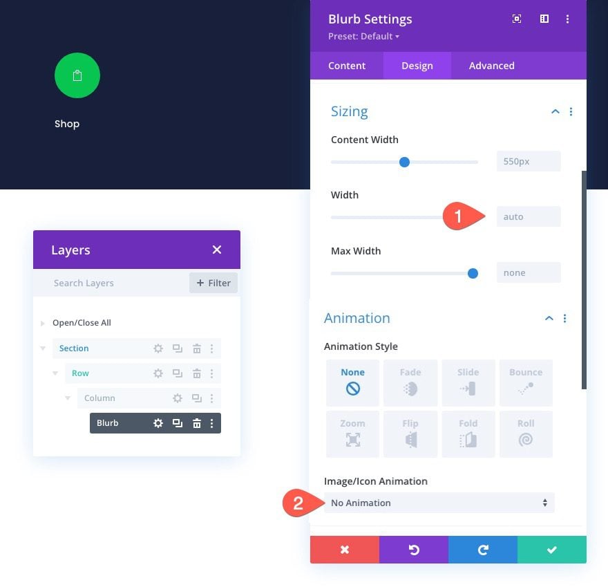
Then update the width and disable the default animation.
- Width: auto
- Image/Icon Animation: No Animation

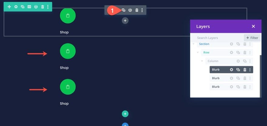
Duplicate the Blurb to Create More Navigation Links
To speed up the design process, duplicate the blurb twice so that you have a total of three blurbs (or navigation links).

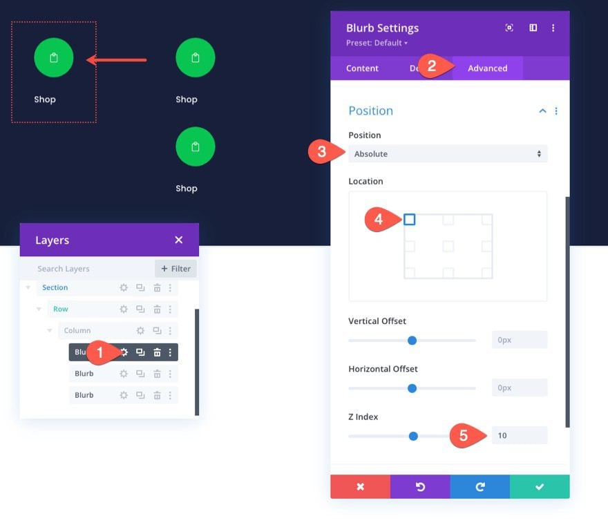
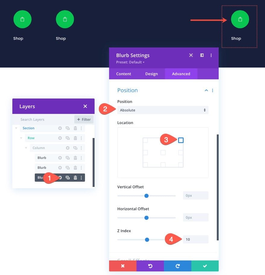
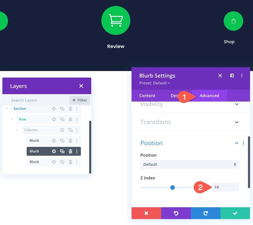
Positioning the First and Third Navigation Links
To first and third blurbs in the navigation menu will have an absolute position. This will allow them to stay in place and not stack on mobile.
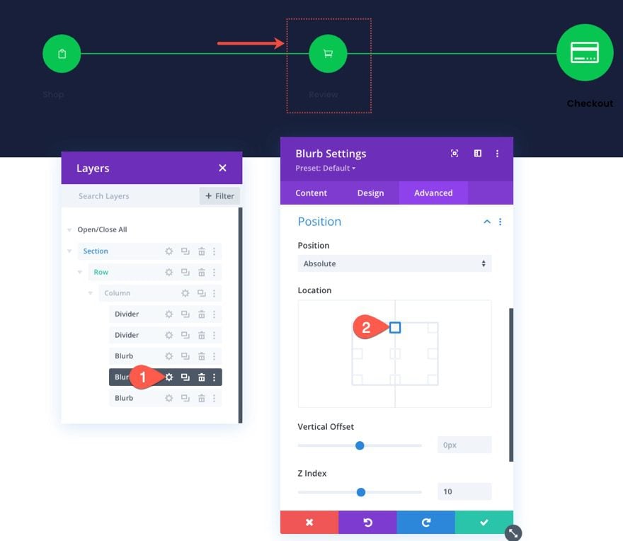
To position the first blurb, open the blurb settings and update the following:
- Position: Absolute
- Location: Top Left
- Z Index: 10
Note: The adding z index is important for keeping the blurb in the front of the divider line we’ll be adding later.

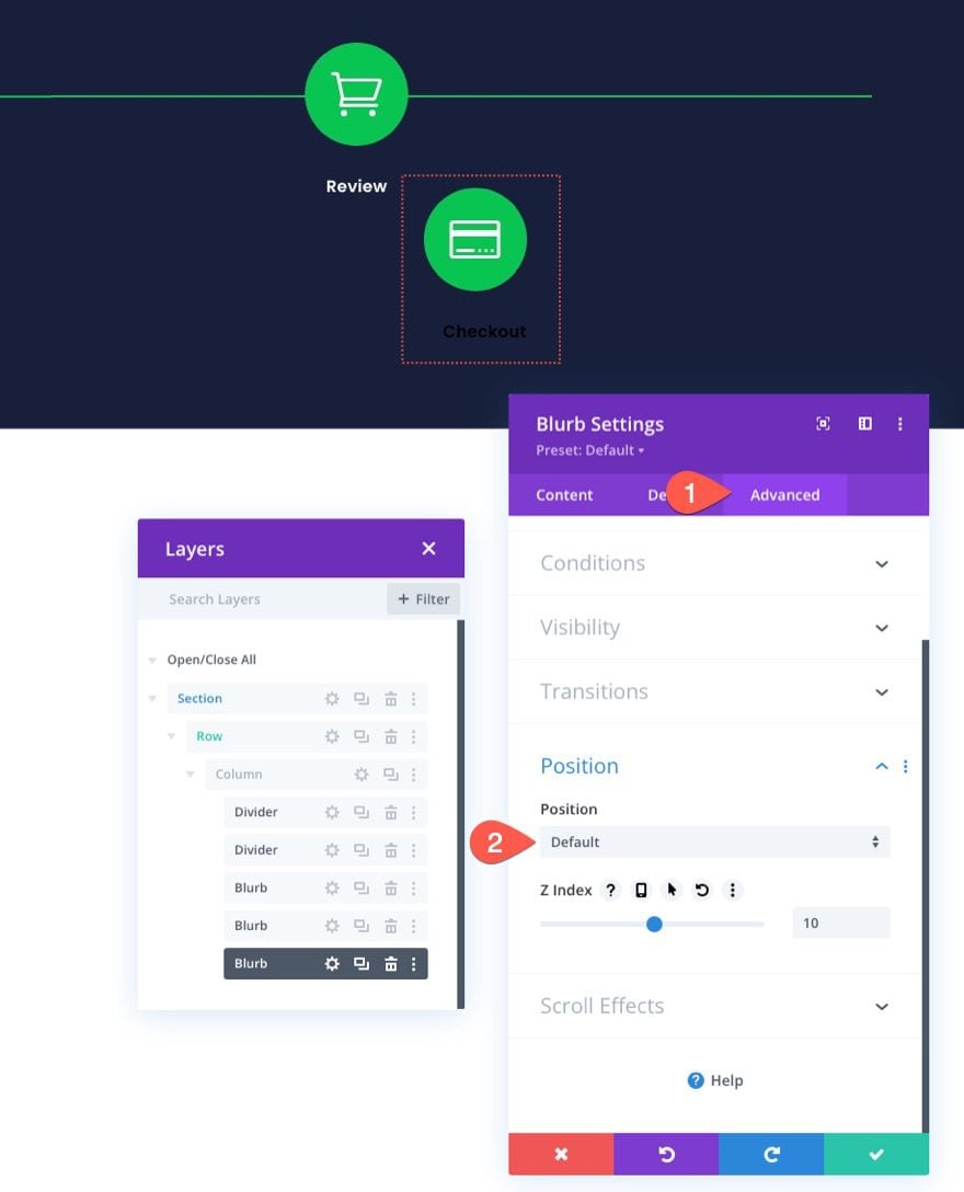
To position the third blurb, open the settings for the third blurb and update the following:
- Position: Absolute
- Location: Top Right
- Z Index: 10

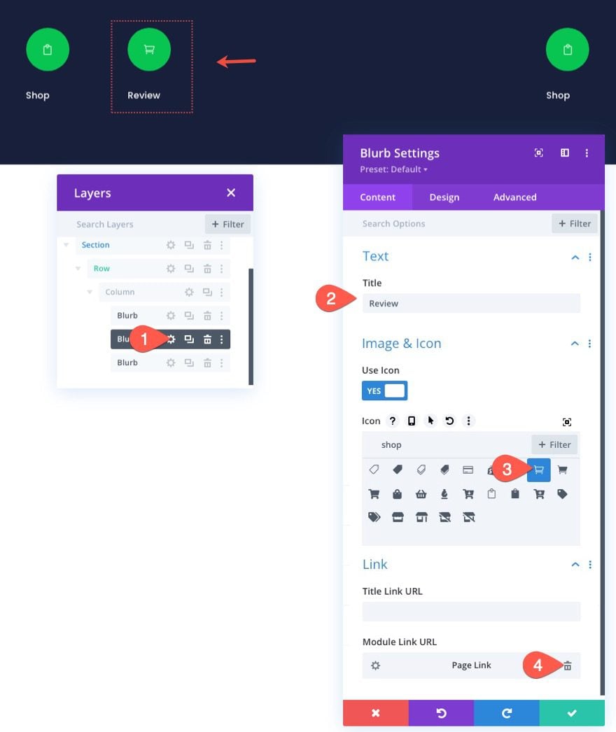
Customizing the Cart/Review Navigation Link
The middle blurb is going to be the cart navigation link.
Open the settings for the second/middle blurb and update the content as follows:
- Title: Review
- Use Icon: YES
- Icon: see screenshot
- Module Link URL: link to cart page

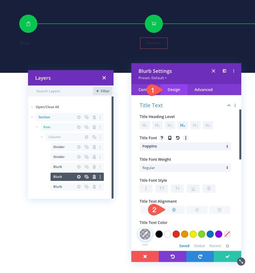
Since we are designing the navigation menu for the cart page in this design, we are going to make this blurb stand out (make it bigger and bold) so that the user knows where they are in the checkout process.
Under the design settings, update the following:
- Image/Icon Size: 48px
- Image/Icon Alignment: Center
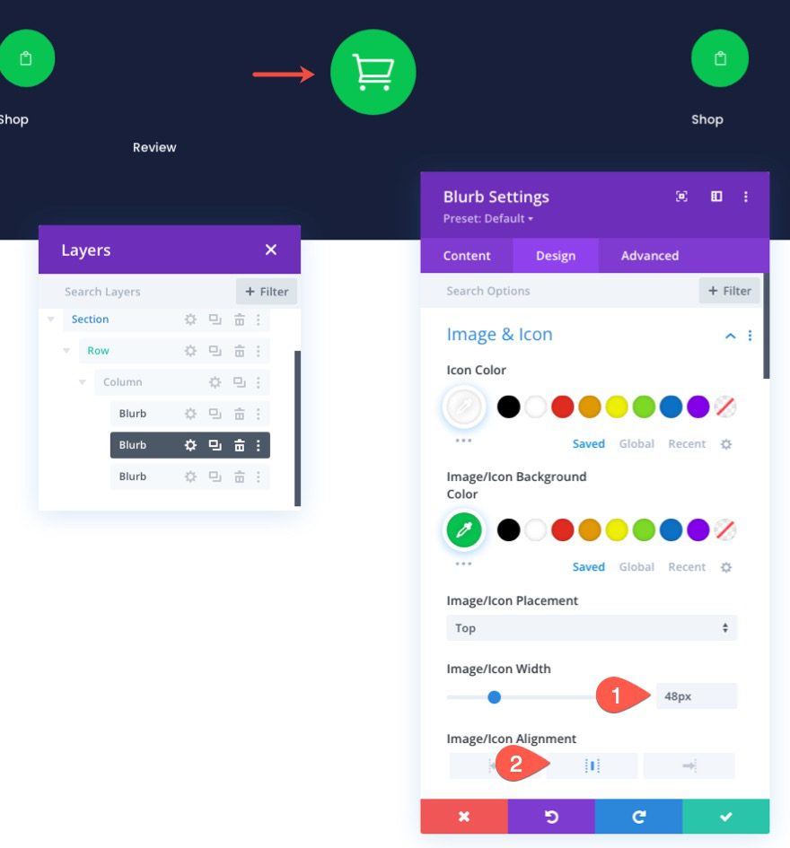

- Title Font Weight: Semi Bold
- Title Text Alignment: Center
- Title Text Size: 16px
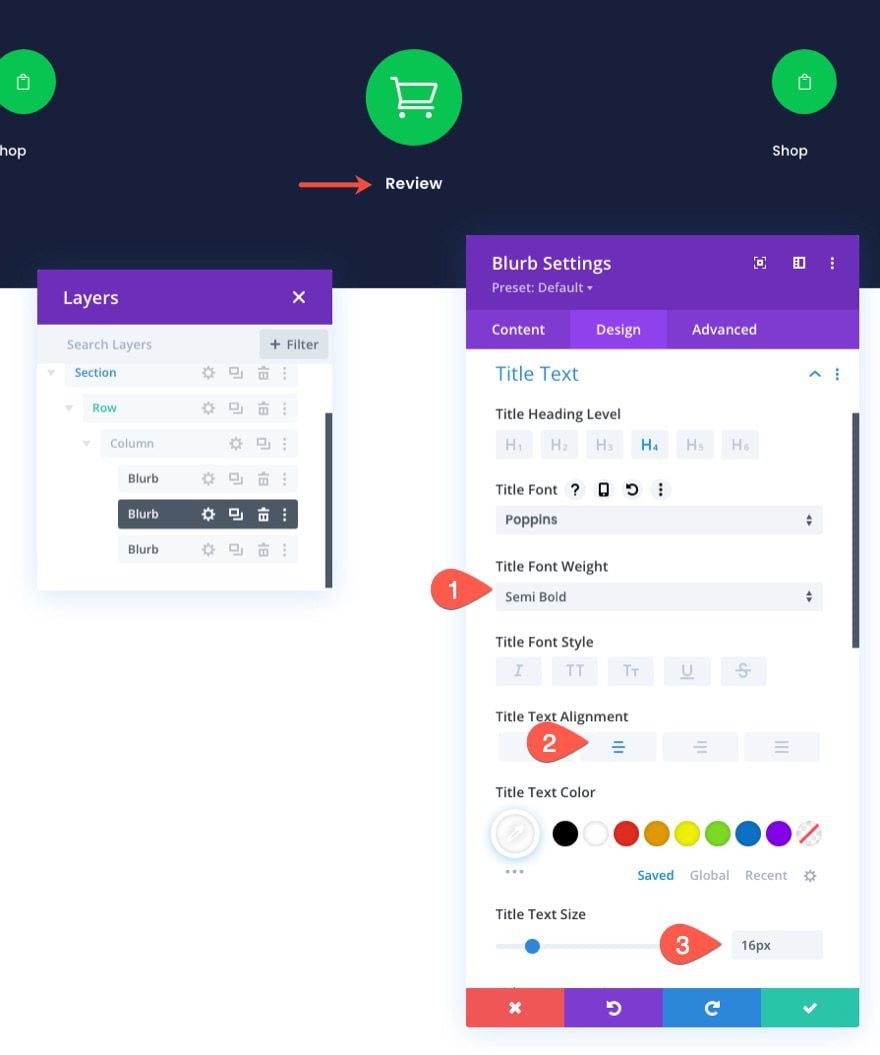

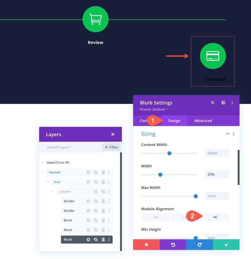
Next, update the size and spacing as follows:
- Width: 33%
- Module Alignment: center
- Margin: -18px top, 0px bottom
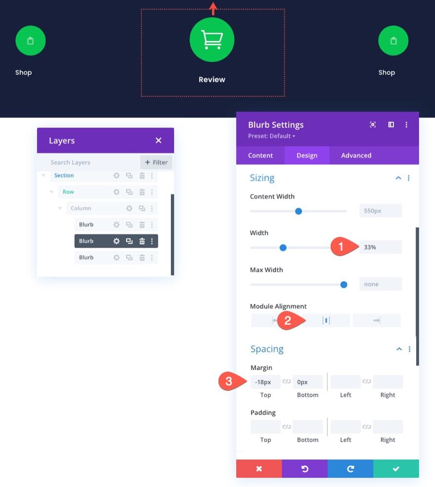

Also, make sure the Z Index is updated to the value of 10.
- Z Index: 10

Customizing the Checkout Navigation Link
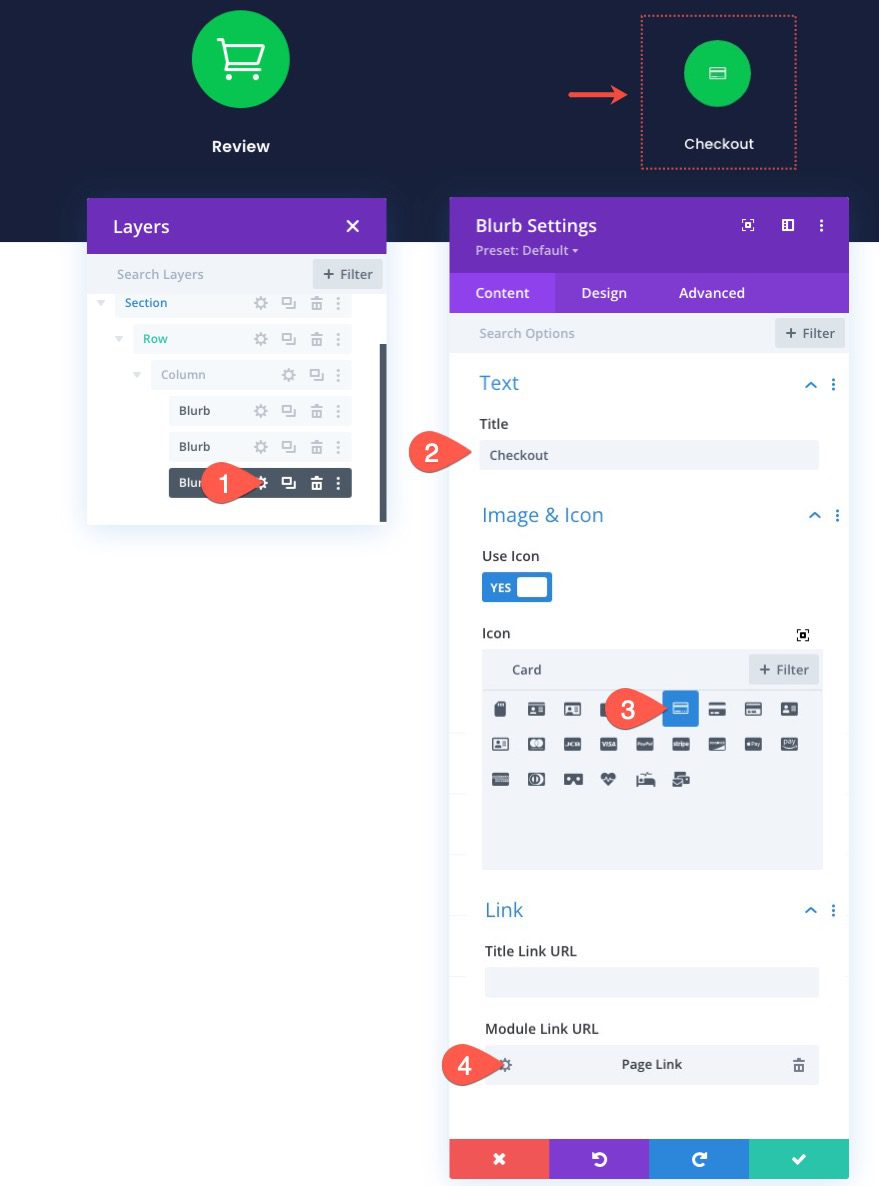
To customize the checkout navigation link, open the settings for the third blurb and update the content as follows:
- Title: Checkout
- Use Icon: YES
- Icon: see screenshot
- Module Link URL: link to the checkout page

Since the checkout page is the next step in the checkout process, we are going to give it a faded color scheme.
Under the design tab, update the following:
- Icon Color: rgba(255,255,255,0.24)
- Image/Icon Background Color: #343854
- Image/Icon Alignment: Right (desktop), Center (tablet and phone)
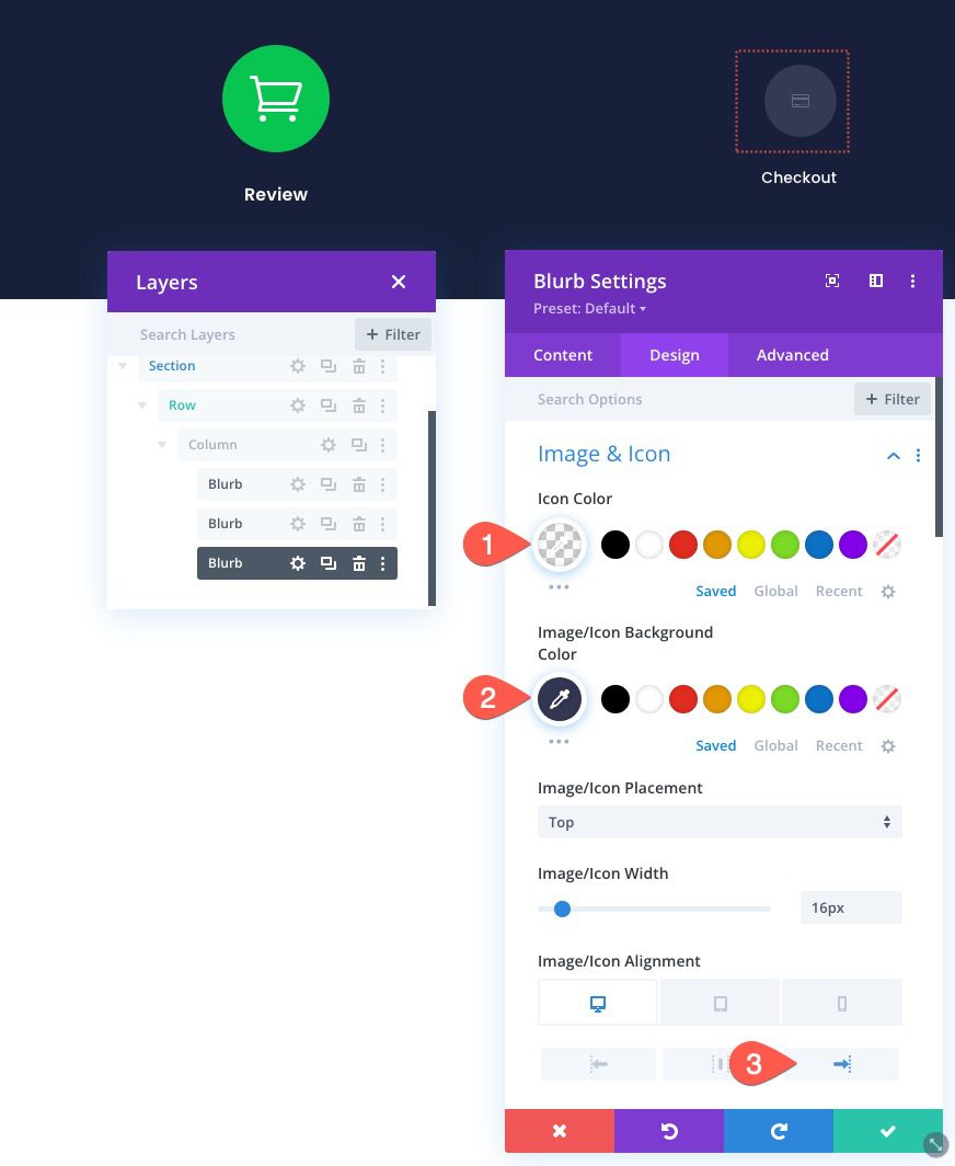

- Title Text Alignment: Right (desktop), Center (tablet and phone)
- Title Text Color: #343854

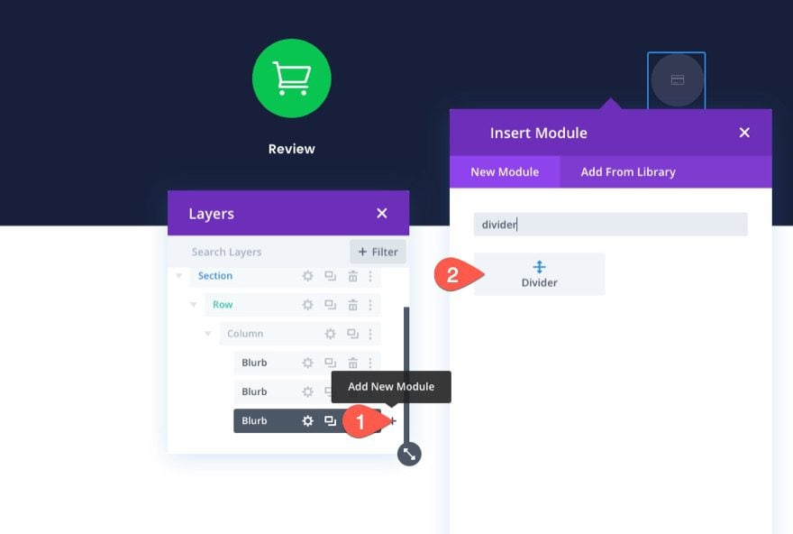
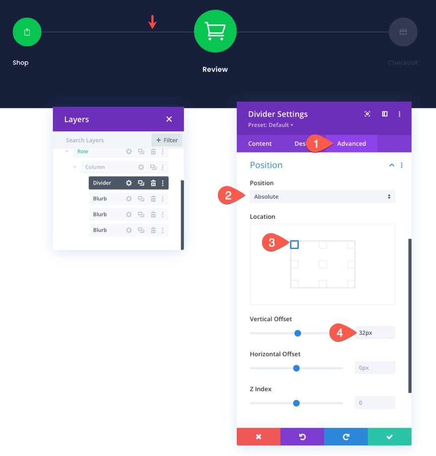
Creating the Divider Lines to Demonstrate Progression
Now that the checkout process navigation links are in place, we are ready to add the divider lines to demonstrate progression in the checkout process.
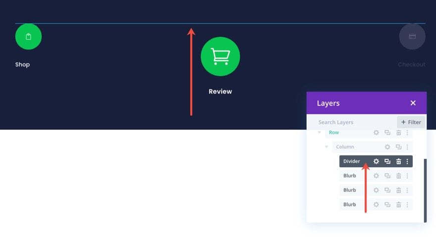
Under the third blurb module, add a new divider module.

Then use the layers view/modal to drag the divider line above the other blurbs.

Next, open the divider settings and update the following design settings:
- Line Color: #343854
- Divider Weight: 2px
- Width: 100%
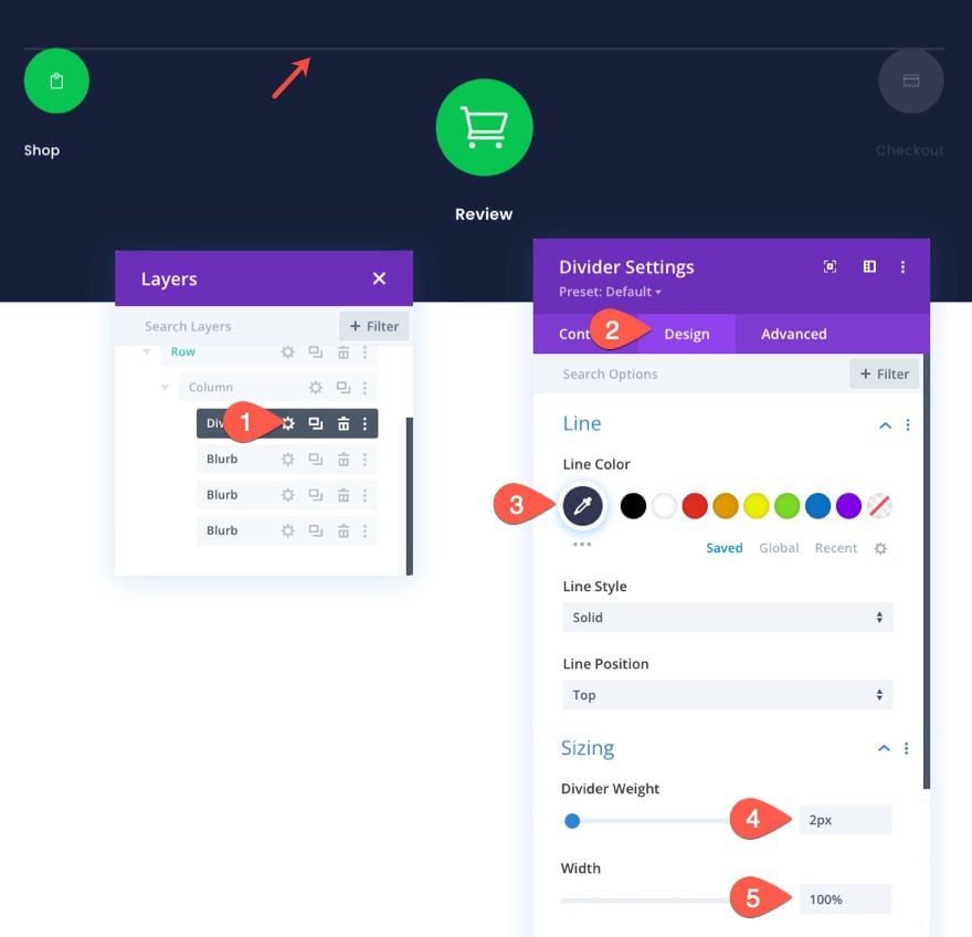

Under the Advanced tab, position the divider line as follows:
- Position: Absolute
- Location: Top Left
- Vertical Offset: 32px

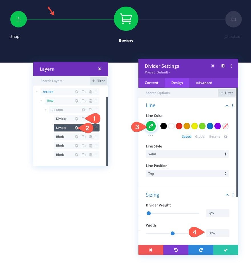
Once the first divider line is in place, we are ready to add the second divider line. This line will highlight the portion of the first divider line that connects the first two blurbs. This will help demonstrate the progression of the checkout process much like a progress bar.
To add the second divider, duplicate the existing divider and update the following design settings:
- Line Color: #08c451
- Width: 50%

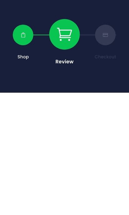
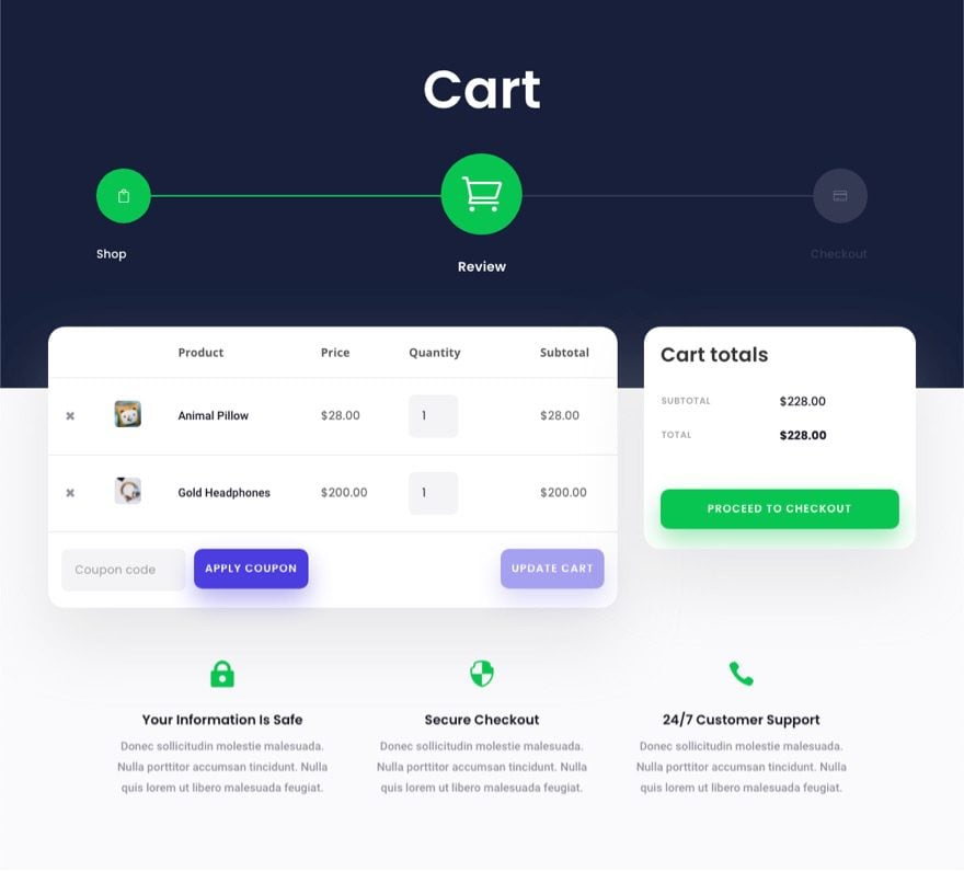
Final Result for the Cart Page Navigation Menu
All done. Now, take a look at the result on desktop and mobile.
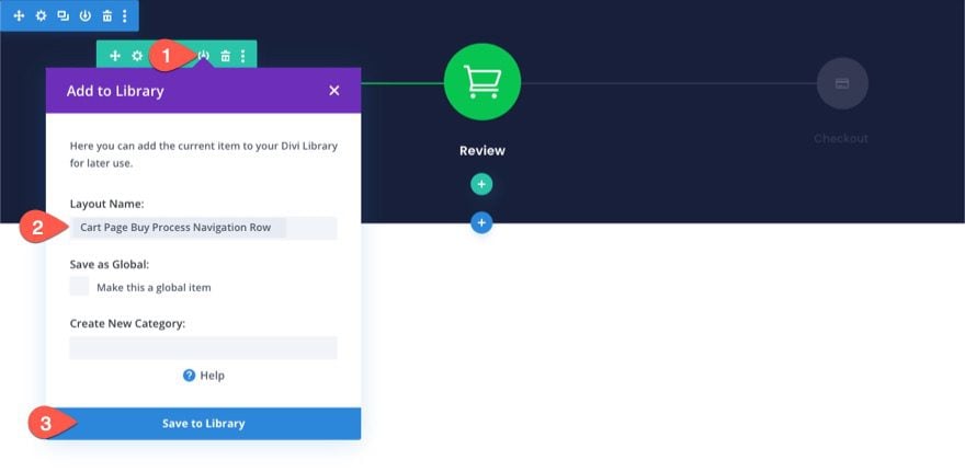
Saving the Row to the Divi Library
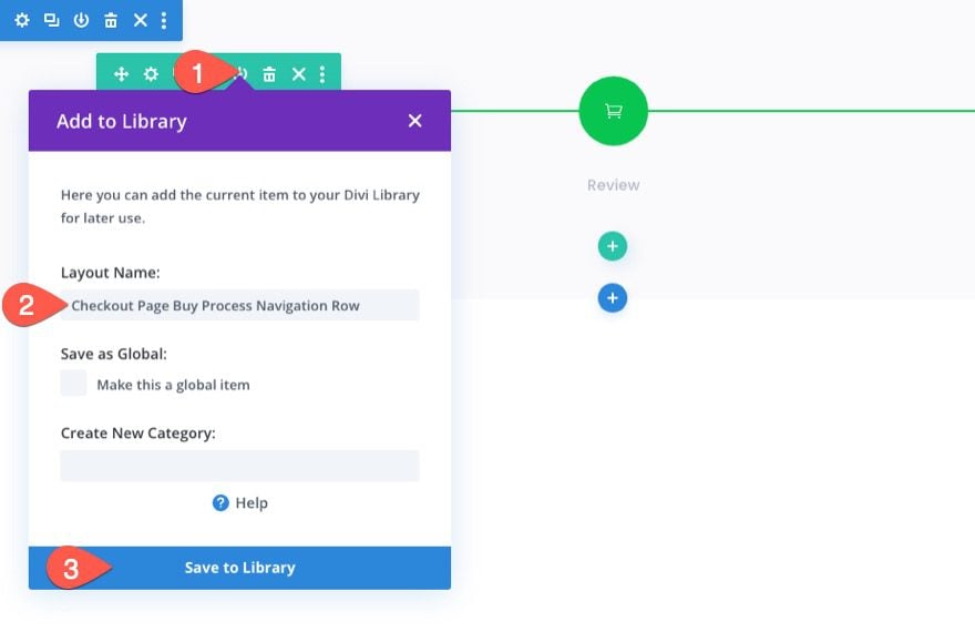
Since we want to be able to add this checkout process navigation menu to our checkout page or template in the future, it is important to save it to the Divi Library. For this example, we’ll save the row to the library. To do that, click the Save to Library icon when hovering over the row. In the Add to Library modal, add the Layout Name and click Save to Library.

Changing the Navigation Design for a Checkout Page
Once the Cart page navigation menu has been saved to the library, we can tweak the design to create a navigation menu for the checkout page. We want to keep the same content and links the same. But we want to change the design to reflect the new progression of the checkout process.
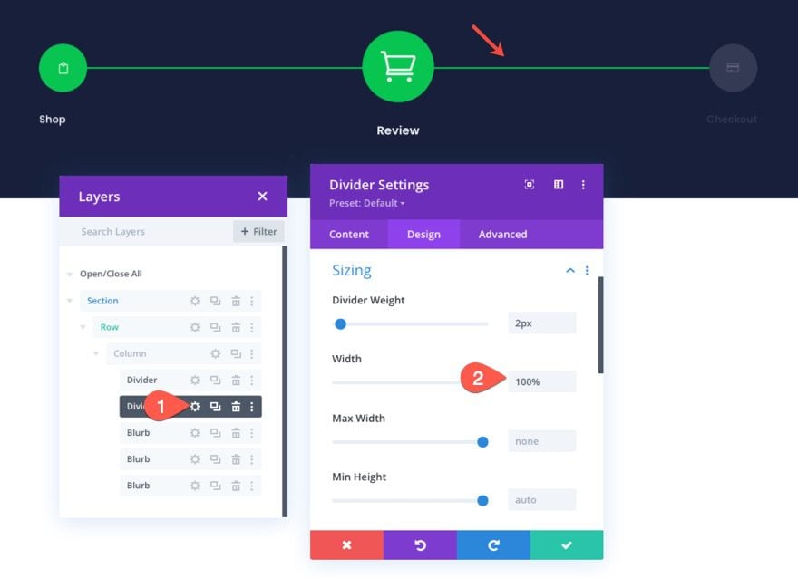
Updating the Divider Line Progression
To update the divider line so that it completes the progression to the checkout navigation link, open the settings for the second divider line and update the width to a value of 100%.
- Width: 100%

Updating the Shop Navigation Link
Since the checkout page we are going to add this to will have a light background, we want a darker title text for each of our nav links.
To do this, open the settings for the “Shop” blurb on the left and update the title text color:
- Title Text Color: rgba(64,71,104,0.36)

Updating the Checkout Navigation Link
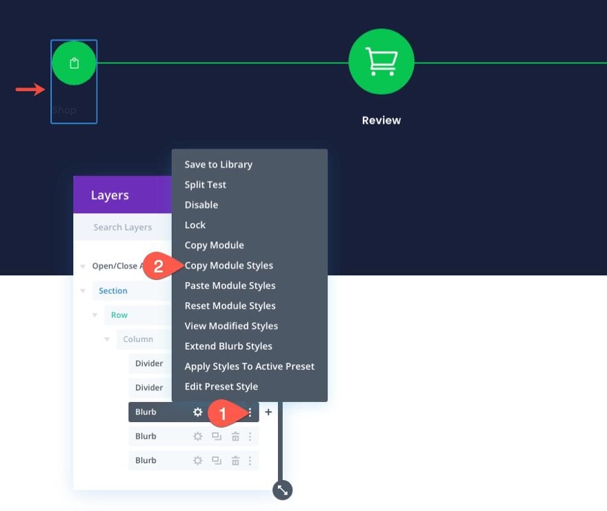
To update the design of the checkout navigation link, copy the module styles of the middle blurb (the Cart/Review link).
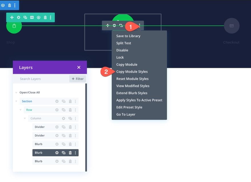

Then past the module styles to the “Checkout” blurb on the right.
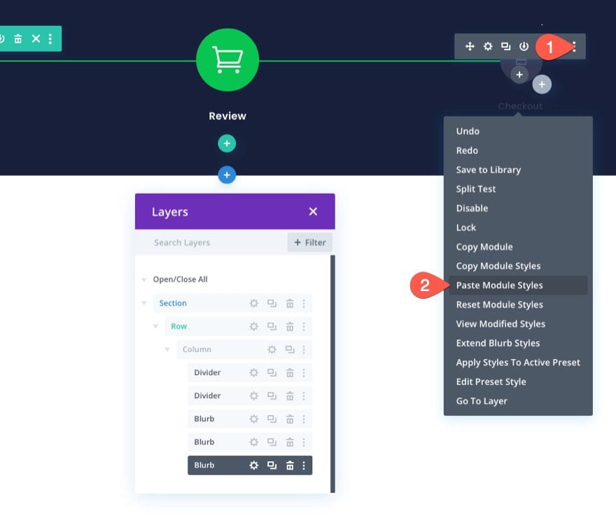

Open the settings of the “Checkout” blurb and update the following:
- Image/Icon Alignment: Right
- Title Text Alignment: Right
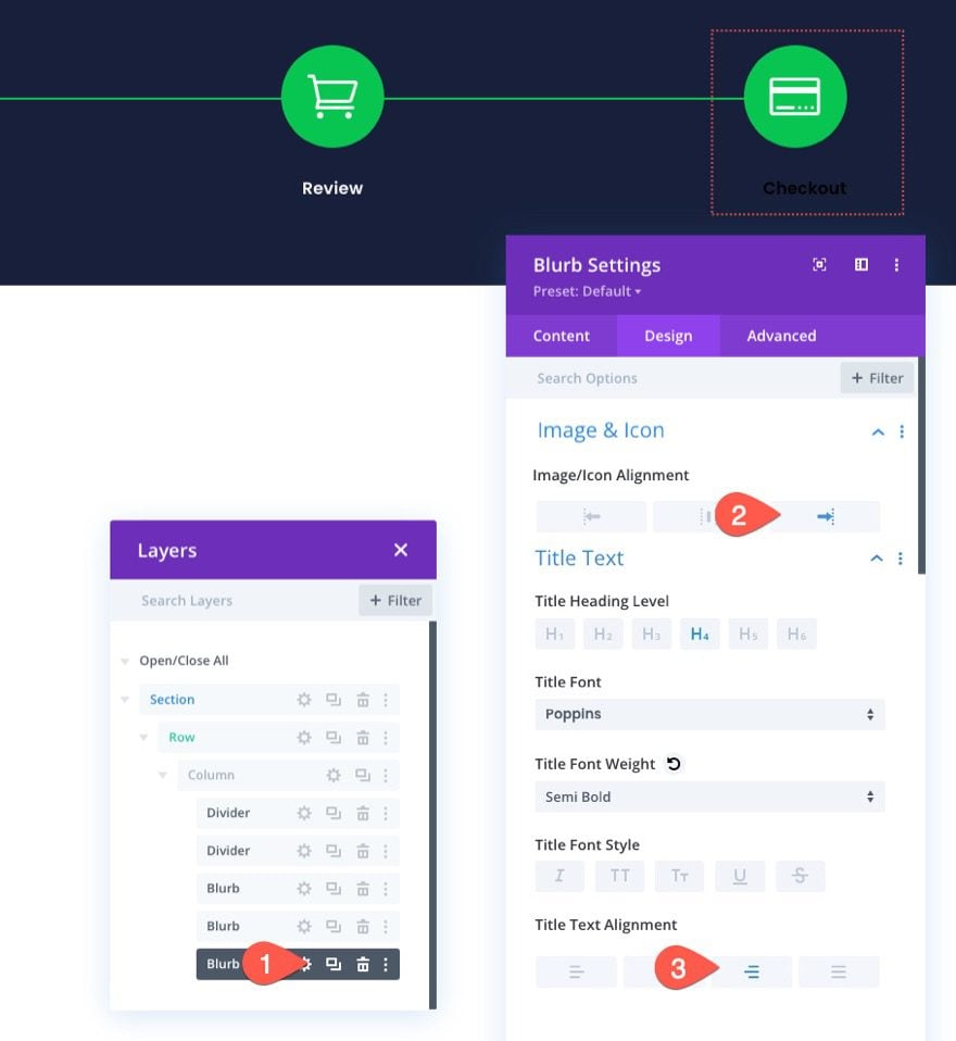

Even though the styles of the middle blurb now occupy this blurb, the blurb still has an absolute position.
Under the advanced tab, change the position back to default. (This will drop the module below the existing modules until we give the middle blurb an absolute position.)

Under the design tab, update the module alignment:
- Module Alignment: Right

Creating the Cart Review Navigation Link
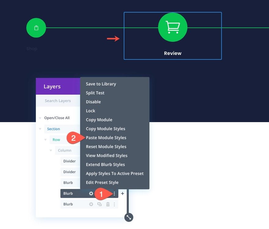
Once the checkout navigation link is done, we can update the middle blurb (Cart/Review Navigation link). To speed up the design process, copy the module styles of the “Shop” blurb on the left.

Then past the module styles to the middle “Review” blurb.

Once done, the “Review” blurb will be positioned to the left, directly on top of the “Shop” module. Use the layers modal to select the “Review” blurb settings and update the position location as follows:
- Location: Top Center

To finish updating the middle blurb, update the following:
- Title Text Alignment: Center

Section Background
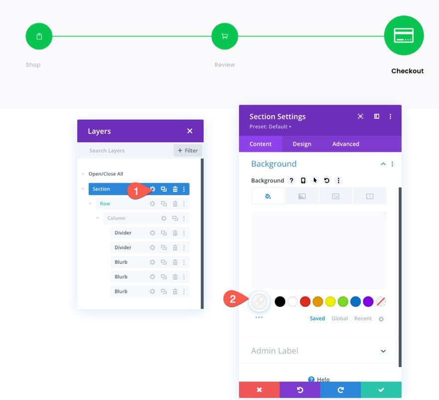
To accurately reflect what the navigation menu will look like on a checkout page with a light background, update the section background color as follows:
- Background Color: #fafafb

Saving the Row to the Divi Library
Just like we did with the Cart page navigation menu, we can save this Checkout page navigation menu to the Divi Library for future use.
Go ahead and save the row containing the menu to the library using the Save to Library icon in the row menu.

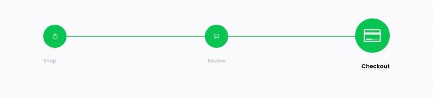
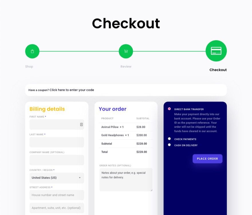
Final Result for the Checkout Page Navigation Menu
Here is the final result of the checkout page navigation menu that accurately reflects the final progression in the checkout process.
Adding the Checkout Process Navigation Menu to the Cart and Checkout Page or Template
Now that both versions of the checkout process navigation menus are saved to the library, we can add them to any page or template we want.
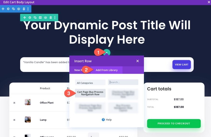
For example, to add the checkout process navigation menu to a WooCommerce Cart template, go to the Theme Builder and click to edit the Cart template’s body layout.
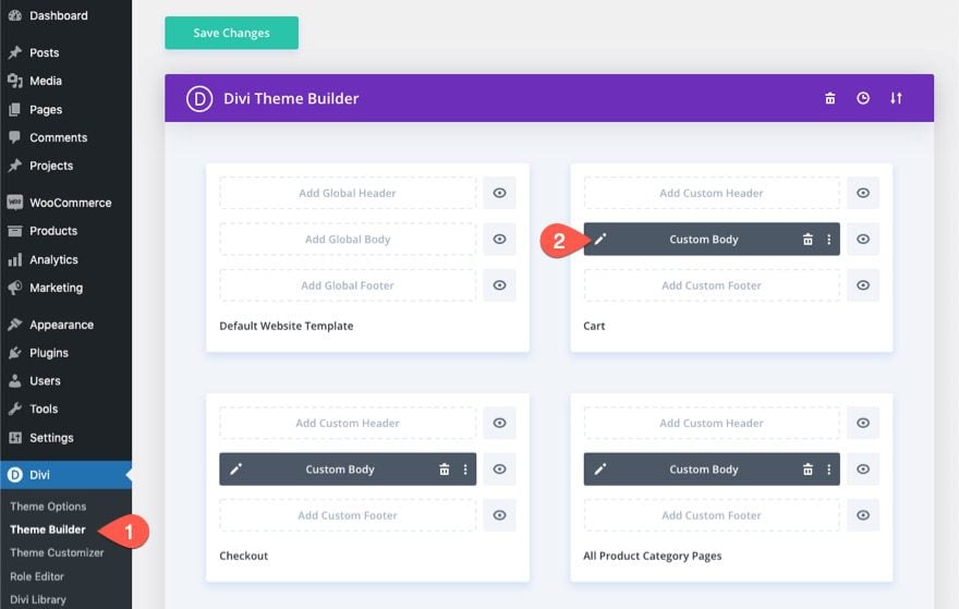

Since we saved our navigation menu as a row in the library, we must remember to add a new row to our template to upload the navigation menu. So, find a spot for the row and click to add a new row. In the Insert Row modal, click the Add From Library tab and select the saved row from the list.

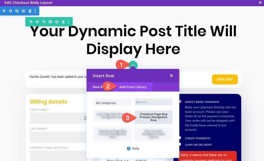
You can repeat the same process to add the navigation menu to the Checkout page template as well.

Final Result
Check out how these checkout process navigation links look on a fully designed template. These designs are also featured in one of our FREE cart & checkout page template sets for Divi.


Final Thoughts
A checkout process navigation menu can be a great asset to your website. And, with Divi, you can build them completely from scratch with all the customizations you need. Plus, you can save the layout to your library so that you can add the menu to any page or template you want with just a few clicks. Hopefully, this will inspire you to create one for your next project and help bring more customers through the checkout process.
I look forward to hearing from you in the comments.
Cheers!
.inline-code{padding: 0px 4px; color: crimson; font-family: Monaco,consolas,bitstream vera sans mono,courier new,Courier,monospace!important} video.with-border {border-radius: 8px;box-shadow: 0 8px 60px 0 rgba(103,151,255,.11), 0 12px 90px 0 rgba(103,151,255,.11);display:block;margin: 0 auto;}
The post How to Design a Checkout Process Navigation Menu in Divi appeared first on Elegant Themes Blog.